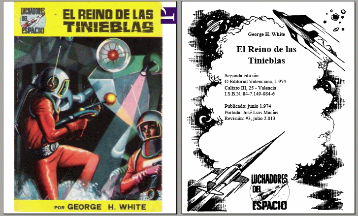
As many here will know, 'Covers' are a classic in CSS fora -- and I have a method that I'd like to improve upon. I think this should be possible to do with Prince, but I'm afraid I'm not familiar enough with it yet.
The idea is to have elements (typically images) of an appropriate class ('cover', 'fullpage', you get the idea) in single pages (trivial CSS: " * + .cover { page-break-before: always; } .cover { page-break-after: always; } ") and then have each element take up as much space as possible on its page -- hence the usual term 'cover'.
If the image is wider than the page, styling it with 'width:100%; height: auto;' will suffice, and at high enough resolutions this will work and look good regardless of media size, just leaving some blank space above and/or below the image. Unfortunately, things are not as easy with 'narrow' images.
As per the CSS specifications (I can't remember where I read that exactly to provide a link, but I'm pretty sure this is how it works -- please feel free to correct me), direct descendants of the <body> element must be given an explicit height, and any percentage values will be interpreted as relative to the parent's WIDTH since, unlike the paged media, the <body> has no defined height by default. So 'cover {height: 100%; }', simple as I think this should be, won't get you anywhere.
Since I always 'print' to one of a few page sizes, as many media queries at the top of the CSS save my day with variations of "@media (min-height: 19cm) and (max-height: 19cm) { .cover { height: 19cm } }" where necessary.
But this 100% effective solution solution doesn't merely lack elegance, it is also clumsy -- should I decide to print on different media sizes, I'd be forced to add a new media height to the CSS every single time. While we wait for CSS specs to evolve into something that allows an easier solution or workaround for this problem, I think Prince javascript-in-CSS might solve it here and now.
I am thinking something similar to the CSS+js pseudocode 'cover { height: media.height(); }' would work for ALL media sizes without modifying a single line anywhere. Then it would be combined with the easy method above for wide covers and we could have a solution both simple and universal to the cover question. We would just need something along the lines of
.cover {
@media (max-aspect-ratio: width()/height() ) { width: 100%; height: auto; }
@media (min-aspect-ratio: width()/height() ) { height: media.height(); width: auto; }
}
in our print CSS if only the image (element) initial dimensions and media height could be queried and later used in javascript.
I haven't had a lot of time to discover a way to do it yet, or even find out whether it's possible at all, so I thought I would ask here.
Your thoughts?

