Styling
When preparing a document with HTML and CSS, you need to first create the content - but then you need to style it to make it visually appealing. You can choose which fonts to use, how to format your text and your paragraphs, choose the layout for your page, give your text, background and style some color, insert images - and much more!
In the following sections you can find detailed information on how to achieve this with Prince.
The major difference between formatting for the web and PDF/Print is that PDF is paginated, which means that content is placed on discrete pages, as opposed to one continuous flow, typical for web pages.
Prince allows you to control a number of options that affect how PDF formats pages, from straight-forward options such as page size, to decorations, headers and footers, numbering and page breaking options. See detailed information in the Paged Media section.
Prince applies default styles to all (X)HTML documents - these style rules can be found in the html.css style sheet, located in the style folder inside the installation directory (see Installation Layout). The initial values for CSS properties are defined internally - the initial @page styles are documented in the Paged Media chapter.
Fonts
Prince supports the Web Open Font (WOFF/WOFF2), TrueType and OpenType (with TTF or CFF outlines, SVG, and CBLC/CBDT or sbix colour bitmaps) font formats, as well as the TTC and WOFF2 font collections.
Defining a font family
To define the font, or the fonts to be used in a document, the font-family property is used. Prince will try to use the specified font, and should glyphs be missing, it will silently fall back to the next font in the cascade - typically a generic font family.
If a paragraph or the entire document are mostly in a specific language, it might help to specify a font suitable for that language, in order to avoid most of the unexpected consequences of this font switching mechanism.
To prevent this font switching mechanism altogether, and force Prince to only use the defined font, the special keyword prince-no-fallback is available: it triggers a warning if any glyphs are not found in the specified font, instead of switching to another one.
h1 { font-family: MyFont, prince-no-fallback; }
The @font-face at-rule can be used to define custom font names. The font-family descriptor defines the font family name that will be used in all CSS font family name matching, and the src descriptor specifies the resource containing font data. They both are required for the @font-face rule to be valid.
The src descriptor can define the resource with a url() function - an optional format() function defines the format of the remotely fetched font. Alternatively, the local() and prince-lookup() functions can be used - the former searches for locally installed system fonts, while the latter will also find fonts defined by other @font-face rules. See CSS Functional Expressions.
    @font-face {
      font-family: MyFont;
      src: prince-lookup("MyFont"),
           url("http://example.com/MyFont.ttf") format("truetype");
    }
In this example we are defining a new font face, called MyFont. We instruct Prince to check if the MyFont truetype font is installed locally or already defined by another @font-face rule, and, all failing, to download it from a remote location.
When a chosen bold and/or italic font is missing, Prince tries to artificially synthesize the missing font - i.e. to embolden or italicize the original font. However, it might lead to undesired results. This feature can be disabled with the --no-artificial-fonts command-line option.
OpenType Features in Prince
Prince supports OpenType features, and enables certain ones by default in specific scripts. The following ones are enabled by default in Prince:
| Script | Enabled features |
|---|---|
| Latin, Greek, Cyrillic | ccmp, rlig, clig, liga, calt, dist, kern*, mark, mkmk, vrt2 |
| Arabic/Syriac | ccmp, rlig, calt, liga, mset, isol, medi, init, fina, kern, curs, mark, mkmk |
| Indic | ccmp, and many other Indic-specific substitutions |
| Other scripts | kern*, mark, mkmk |
|
* Kerning can be disabled with the |
|
Microsoft has a list of the OpenType feature names here.
In order to enable specific OpenType features, or specific font variants, the following properties can be used:
- The property
font-variant-capsenables the display of small capitals (the OpenType featuressmcpandc2pc). - The property
font-variant-ligaturesallows for fine-tuning of various ligature types. (See also Typographic Ligatures). - The property
font-variant-numericspecifies control over numeric forms.
Note that the font-variant CSS property can be used as a shorthand for these properties.
font-variant: historical-ligatures all-small-caps oldstyle-nums;
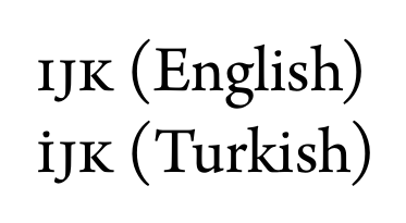
Prince also supports language-specific OpenType shaping with the locl feature, which is automatically enabled with the use of the HTML or XML lang or xml:lang attributes. As an example, the Arno Pro font has small-caps that are language sensitive, since Turkish has unique case rules for dotted and dotless letter "i".
    <p><span xml:lang="en">IJK</span> (English)</p>
    <p><span xml:lang="tr">IJK</span> (Turkish)</p>
If this example is rendered with small-caps in the Arno Pro font, the two lines will look like this:
In cases where the XML or HTML attributes cannot be applied, such as in CSS generated content in Before and After pseudo-elements, or in page margin boxes, the CSS property -prince-lang can be used.
It is possible to also enable other OpenType features, not covered by the previous properties, by using the font-variant CSS property with the prince-opentype() function (see CSS Functional Expressions).
It is a very powerful tool, but care must be taken in which order the features are enabled! All required features need to be explicitly enabled: please note that enabling one feature will disable all the default features.
Generic font families
Prince maps the CSS generic font families to the Microsoft Core Fonts. The Microsoft Core Fonts are pre-installed on Windows and MacOS systems but not on Linux systems. To use them on Linux you must install the msttcorefonts package, which is available for most Linux distributions.
Instructions for installing fonts on Linux greatly depend on the distribution you are running - we recommend checking the documentation for your own distro. Here are links to fonts documentation for Ubuntu, openSuse, Debian, and Alpine Linux.
The following table shows the default fonts for the main languages on Windows, MacOS and Linux.
| Generic family | Operating system | Language | Actual font |
|---|---|---|---|
serif |
Windows | Latin | Times New Roman |
| Chinese | MingLiU, Microsoft YaHei, SimSun | ||
| Japanese | MS Mincho, Yu Gothic | ||
| Korean | Batang, Malgun Gothic | ||
| Devanagari / Hindi | Mangal | ||
| MacOS | Latin | Times New Roman | |
| Chinese | LiSong Pro | ||
| Japanese | Hiragino Mincho ProN | ||
| Korean | AppleMyungjo | ||
| Devanagari / Hindi | Devanagari MT | ||
| Linux | Latin, Greek, Cyrillic | Times New Roman, DejaVu Serif, DejaVu LGC Serif, Liberation Serif | |
| Chinese, simplified | AR PL UMing CN, AR PL SungtiL GB | ||
| Chinese, traditional (TW) | AR PL UMing TW, AR PL Mingti2L Big5 | ||
| Chinese, traditional (HK) | AR PL UMing HK, AR PL Mingti2L Big5 | ||
| Japanese | Kochi Mincho, IPAMincho, TakaoMincho | ||
| Korean | UnBatang, Baekmuk Batang | ||
| Devanagari / Hindi | Lohit Devanagari | ||
| Bengali | Lohit Bengali, Ani, Mukti Narrow | ||
| Gurmukhi/Punjabi | Lohit Punjabi | ||
| Gujarati | Lohit Gujarati | ||
| Tamil | Lohit Tamil | ||
| Telugu | Lohit Telugu | ||
| Kannada | Lohit Kannada | ||
| Malayalam | Lohit Malayalam | ||
| Oriya | Lohit Oriya | ||
| Thai | Garuda | ||
| Emoji | JoyPixels, Noto Color Emoji | ||
| Symbols | OpenSymbol, DejaVu Sans | ||
sans-serif |
Windows | Latin | Arial |
| Chinese | |||
| Japanese | MS Gothic | ||
| Korean | Dotum | ||
| MacOS | Latin | Arial | |
| Chinese | LiHei Pro | ||
| Japanese | Hiragino Kaku Gothic ProN | ||
| Korean | Apple SD Gothic Neo, Apple Gothic | ||
| Linux | Latin, Greek, Cyrillic | Arial, DejaVu Sans, DejaVu LGC Sans, Liberation Sans | |
| Chinese, simplified | AR PL UKai CN, AR PL KaitiM GB | ||
| Chinese, traditional (TW) | AR PL UKai TW, AR PL KaitiM Big5 | ||
| Chinese, traditional (HK) | AR PL UKai HK, AR PL KaitiM Big5 | ||
| Japanese | Kochi Gothic, IPAGothic, TakaoGothic | ||
| Korean | UnDotum, Baekmuk Gulim | ||
monospace |
Windows | Courier New | |
| MacOS | |||
| Linux | Courier New, DejaVu Sans Mono, DejaVu LGC Sans Mono, Liberation Mono | ||
The complete list of defaults, including details like e.g. the exact Unicode ranges Prince is using, can be found in the fonts.css file located in the installation directory of Prince resources. (See Installation Layout).
In order to redefine these defaults, see Redefining the generic font families.
Redefining the generic font families
The CSS generic font families can be redefined to use different fonts by editing the fonts.css file in the Prince installation (see Installation Layout). Each font family is defined using a @font-face rule, which maps a font family to an actual font either by name or by filename. (See Generic font families).
Here is an example of mapping the generic "sans-serif" font family to the local system font called "Trebuchet MS".
fonts.css
    @font-face {
        font-family: sans-serif;
        src: local("Trebuchet MS")
    }
It is also possible to map the generic font families to local fonts specified by the filename of the TrueType font file. This will usually require using multiple @font-face rules, one for each TrueType font file in the font family, which usually includes four files (normal, bold, italic and bold-italic). Here is an example of mapping the generic "sans-serif" font family to the "Trebuchet MS" font using filenames, assuming that the font is installed in the usual system directory on Linux.
fonts.css
    @font-face {
        font-family: sans-serif;
        font-style: normal;
        font-weight: normal;
        src: url("/usr/share/fonts/truetype/msttcorefonts/trebuc.ttf")
    }

    @font-face {
        font-family: sans-serif;
        font-style: normal;
        font-weight: bold;
        src: url("/usr/share/fonts/truetype/msttcorefonts/trebucbd.ttf")
    }

    @font-face {
        font-family: sans-serif;
        font-style: italic;
        font-weight: normal;
        src: url("/usr/share/fonts/truetype/msttcorefonts/trebucit.ttf")
    }

    @font-face {
        font-family: sans-serif;
        font-style: italic;
        font-weight: bold;
        src: url("/usr/share/fonts/truetype/msttcorefonts/trebucbi.ttf")
    }
A low-level mechanism to fine-tune the set of Unicode codepoints that may be supported by the font face for which it is declared is provided through the unicode-range CSS descriptor. Its value is a comma-delimited list of Unicode range values. The union of these ranges defines the set of codepoints that serves as a hint for user agents when deciding whether or not to download a font resource needed for the test content of a particular page.
Finally, Prince can be instructed not to use system fonts with the --no-system-fonts command-line option. Only fonts defined with @font-face rules in CSS will be available.
Layout
Layout is the way in which text and pictures are set out on a page. It defines the final look of a document. Prince understands layout by means of CSS, cascading style sheets.
In the following chapters we shall go through the main points when preparing the layout of a page. It mainly follows the general steps of layout for web pages: starting from Text formatting and Paragraph formatting, via the Box Model, until Tables, Lists, Columns, Floats, Flex Layout, and Footnotes.
A separate chapter, Paged Media, will analyze in-depth the major difference between formatting for the web and PDF/Print, namely that PDF is paginated, content is placed on discrete pages.
Text formatting
Text can be styled with CSS by defining font styles or text layout styles.
After choosing an appropriate typeface for your text with the font-family property (see Fonts), you can assign it different sizes with the font-size property.
Next up you should decide whether to give it some color. The default text color for a page is defined in the body selector, but each selector can have its own color.
    body {
        font-family: Helvetica, Arial, sans-serif;
        color: blue;
    }
Special formatting can be achieved through the font-style, font-weight or font-variant properties - all of which can also be set with the shorthand property font. For special effects one can use the properties text-transform, text-decoration - or even text-shadow.
It is also possible to style the vertical alignment of text in an inline box with the vertical-align property. The value baseline is the default, sub and super align the baseline of the element with the subscript-baseline or superscript-baseline of its parent respectively. The text-top and text-bottom values align the top of the element with the top or bottom of the parent's font, while middle aligns the middle of the element with the baseline plus half the x-height of the parent.
In order to determine how compact the text should be displayed, the letter-spacing can be used. Alternatively, the property font-stretch might be used, but note that it does not change the geometry of any arbitrary font by stretching or shrinking it - instead, it merely instructs Prince to choose the most appropriate face of the font, if the selected font offers several ones. Also note that this property is not supported for system fonts on Windows.
In a similar fashion, the property word-spacing can be used to determine the distance between words.
The directionality of the text is controlled through the Writing Mode.
Paragraph formatting
Now that you have decided on the basic properties of the text, you can turn your attention to styling the paragraphs. The text-align property is used to control how text is aligned within its containing box, while the text-indent property determines the indentation of the first line of text in the element.
If the text-align property (acting under the hood as a shorthand for the property text-align-all) has a value of left, right or center, the text will be aligned to the left, right or center respectively. The justify value instructs Prince to justify text.
It is not uncommon, in printed texts, to align text based on whether it appears on a left or right page. To support this, two new keywords are added to the text-align property: inside is the same as 'left' on right pages and 'right' on left pages, and outside is the same as 'right' on left pages and 'left' on right pages.
Prince adds the property -prince-text-justify to define how to treat justified text for CJK languages. The value prince-cjk allows space to be inserted between CJK characters when justifying even if there aren't any space characters.
The last line of an element can receive its own alignment style with the text-align-last property. It takes the same values as text-align.
    p {
        text-align-all: justify;
        text-align-last: right;
    }
Prince also supports a two-value syntax for text-align, where the second (optional) value is a shorthand value for text-align-last. The previous example can thus also be express in the following way:
    p {
        text-align: justify right;
    }
It is also possible to style the first line of a paragraph in a different way - to achieve this, the selector ::first-line is used.
    p::first-line {
        text-indent: 8em;
    }
It is not unusual to give the first letter of a paragraph a bigger font size than the rest of the paragraph. The selector ::first-letter is useful for this purpose.
    p::first-letter {
        font-size: 2em;
    }
One of the most common use cases is for so-called drop caps - large capital letters at the beginning of a chapter that have the depth of several lines of text.
In the following example we are selecting the first letter of the first paragraph, which gets styled much bigger than the normal text, and gets floated to the left. The normal text is wrapping around this first large letter.
    p:first-child::first-letter {
        font-size: 5em;
        line-height: 3rem;
        float: left;
    }
Another important aspect when formatting a paragraph is how compact the text lines should appear on the printed page. The property line-height can be used to determine the height of text lines.
The property line-stacking-strategy allows to choose whether individual lines should have their height determined based on their content, or whether all lines in a paragraph should have the same height, or a compromise where their heights are determined by their content and then rounded up to a multiple of the paragraph line height.
In order to lay out text in a well-balanced way, it might at times be necessary to hyphenate some words - to enable hyphenation, the hyphens property is used. For details please refer to the section on Hyphenation.
Prince also allows for line-breaking in certain situations even in the absence of whitespace - for example, after slashes in long URLs. This behavior can be disabled with the -prince-linebreak-magic property for situations in which more precise control over line-breaking is preferred.
The property overflow-wrap controls wrapping behavior of last resort: whether it is better for a word to overflow its container, or to be broken at an arbitrary point (subject to white-space, and not splitting within a grapheme cluster), without adding a hyphen.
Prince does not support word-break:break-word to achieve a similar effect - use word-break: break-all, or overflow-wrap:break-word instead.
Writing Mode
A writing mode describes the directionality of a script, i.e. it describes the direction the script is to be read. In (X)HTML, the language of a document, or of an element, is defined by the lang or xml:lang attributes - where this is not available (such as in CSS generated content in Before and After pseudo-elements, or in page margin boxes), Prince provides the CSS property -prince-lang (see also OpenType Features in Prince for the impact this has on language-specific OpenType shaping).
To control the rendering of the text, a couple of specific CSS properties can be used: the direction property defines the inline direction of the script, that is left-to-right (like e.g. Latin or Indic scripts) or right-to-left (like e.g. Arabic and Hebrew scripts).
The writing-mode property, on the other hand, describes the block direction of the script, namely whether the text should be laid out horizontally, top-to-bottom (like e.g. Latin or Arabic scripts), or vertically, right-to-left (like e.g. Chinese scripts). The default value is horizontal-tb, which means horizontal, top-to-bottom.
Prince sets the PDF direction based on the direction and writing mode of the document root element to support right-to-left books.
Changing the writing mode of a document, that is, the inline or block direction, not only changes the direction of the script, but also affects several other aspects of the printed document.
The page selector pseudo-classes :recto and :verso (see Selecting pages) are relative to the direction of the script. In a left-to-right script, :recto is the right-hand side of a spread, and :verso is the left-hand side, while in a right-to-left script these values are inverted: :recto defines the left-hand side of a spread, and :verso defines the right-hand side. See also Selecting pages.
Columns (see the chapter on Columns) change their orientation when the writing mode is changed - the writing-mode value vertical-rl arranges the columns horizontally, top-to-bottom.
This can be used to rotate content - see Printing wide content sideways and Rotating content in table cells.
Box Model
All HTML elements follow the CSS box model. Their margin, border, padding and background can all be styled - and they can even cast a shadow with the property box-shadow.
Margin
At the very outside of the box are the margins. Each margin's size can be set individualy with the properties margin-top, margin-bottom, margin-left and margin-right, or you can use the shorthand property margin to specify all four margins together. The syntax of the shorthand property is:
margin: top right bottom left
If there are only:
- three values: the left margin is set equal to the right margin;
- two values: the left margin is set equal to the right margin, and the bottom margin is set equal to the top margin;
- one value: all margins are made equal.
Prince expands the margin properties with -prince-margin-inside and -prince-margin-outside, defining the margin respectively on the inside or outside of a spread: inside is on the right when used on a left-facing page, and on left on a right-facing page; outside is on the left when used on a left-facing page, and on the right on a right-facing page.
Always keep in mind that margin-top and margin-bottom of blocks are combined (i.e. "collapsed") into a single margin according to a possibly rather complex behavior known as margin collapsing. The notable exception is the behavior of margins in Flex Layout.
Prince also supports page and column floats - in some cases, the margin-top and margin-bottom values of these floats are overwritten by alternative margin value specified with the -prince-margin-alt property. For details, please see Margins of Page and Column Floats.
Border
The border of a box can be styled with several border properties. The borders can either be individually styled with border-top, border-right, border-bottom and border-left, or the shorthand property border can be used to style all four borders of the box in the same way.
To style the borders, the border-color, border-style and border-width properties can be used. For each of them, also top, right, bottom and left variants are available to style each border separately.
The border-radius property can be used for styling rounded corners.
The border-clip property splits the borders into parts along the border edge. Please note that currently this property only applies to footnotes.
Padding
The property padding defines the padding inside the box model. Each padding's size can be set individually with the properties padding-top, padding-bottom, padding-left and padding-right, or you can use the shorthand property padding to specify all four paddings together. The syntax of the shorthand property is:
padding: top right bottom left
If there are only:
- three values: the left padding is set equal to the right padding;
- two values: the left padding is set equal to the right padding, and the bottom padding is set equal to the top padding;
- one value: all paddings are made equal.
Background
The background of an element can be styled with the background-color and the background-image properties, or with the shorthand property background. See also Background Images.
Various standard properties are available to position the background, to clip it or to determine whether, and how it should be repeated. Prince extends control on the background with the -prince-background-image-resolution property, used to control image size in print (see Image Size), and with the bleed modifier of the background-attachment property, which, when used together with background-size: cover, allows a background image to cover the entire page bleed area (see Trimming marks).
Display
Every HTML element is displayed in a way depending on what type of element it is. Most elements are displayed as either block or inline elements. The default display value can be changed with the display property.
A block element always starts on a new line and takes up all the available width.
An inline element, on the other hand, does not start on a new line, and only takes up as much space as necessary.
inline elements are not allowed to have block elements inside it.
A hybrid type, namely the inline-block element, is like inline elements, but it can have a width and a height - which can be very useful when you want to create a grid of CSS boxes that fills all the width and wraps nicely. The inside of an inline-block element is formatted like a block box.
Care needs to be taken with inline-block elements, because Prince cannot split them over several pages.
The value run-in displays a block element as if it were an inline element at the beginning of the following block element.
With the value list-item, the element is effectively transformed into a list item - for more on lists, please see the chapter Lists.
The value flex enables Flex Layout, while inline-flex makes an element behave like an inline element and lays out its content according to the flex layout model.
Several values refer to Tables, making elements behave as if they were table elements. However, the value inline-table has no direct equivalent in HTML - it behaves like a table HTML element, but as an inline element, rather than a block element. Inside the table box is a block context.
The special value none, which removes the content from the document, is very useful when hiding certain elements in the printed layout.
Position
Elements can be positioned in various ways with the position CSS property, which can take the values static, relative, absolute, fixed, as well as running( name ).
The keyword static is the default value, and simply places the element in its natural place in the document flow.
The keyword relative does basically the same, except that it furthermore allows to alter the position, relative to where it appears in its natural place, while the keyword absolute places the element in an absolute position relative to the page area (see Page regions). The element needs then to be moved into its chosen place: the properties top, bottom, left and right can be used to move the element, respectively adding a "buffer" space at the top, bottom, left or right of the element.
Prince adds two further properties, in order to handle common positioning tasks in page spreads, namely inset-inside and inset-outside, adding the "buffer" space respectively inside or outside the page of a page spread (see also Paged Media).
The functional expression running( name ) is used for moving an element from the natural document flow into a specific page region, and is explained in detail in the chapter Taking elements from the document.
Transformations
Prince supports CSS transformations of Level 1, with some limitations: it recognizes transform and transform-origin, but does not recognize transform-box. Furthermore, Prince does not allow perspective transforms.
The transform property can be used to rotate, translate, scale or skew an element.
The transform property currently does not affect SVG elements - they need to use their own transform attribute instead.
The transform property function rotate() rotates the element clockwise from its current position. Negative values rotate conter-clockwise.
The function translate() moves an element along a vertical and/or horizontal axis. The functions translatex() and translatey() move the element along one of those axis only. The function translate3d() is supported if the Z (third) coordinate is zero, thus making it equivalent to the 2D translate().
The function scale() affects the size of the element - note that this also alters other properties of an element, such as its font-size, padding, height and width. The functions scalex() and scaley() transform the element in one dimension only.
The functions skewx() and skewy() tilt an element to the left or right. There is no shorthand form.
The origin for the transformations, i.e. the point around which a transformation is applied, can be set with the transform-origin property.
If only one term is given, then the second component is assumed to be center. In particular, if only a percentage or length is given, then it is assumed to be the horizontal coordinate.
If both values are given as keywords, order doesn't matter; but if two coordinates are given and either coordinate is a length or percentage, then the horizontal component must come first: so top 50% is not valid, but top and top center and 50% top are all valid and equivalent.
Lists
A list item has two parts: marker and content.
The content part is rendered inside the list item's border box, and is styled the same way as a normal block, such as div or p element.
The marker positioning is determined by the list-style-position property and is styled using the ::marker pseudo-element.
List markers
The content property can be applied to the ::marker pseudo-element to specify a custom marker for list items.
CSS
li::marker { content: "No. " counter(list-item) }
List marker position
List markers are rendered outside the list item in the left margin area by default. If the CSS property list-style-position has value inside, the marker is rendered as the first inline box inside the list item.
CSS
    ol {
        padding-left: 1cm;
        border: solid 2px darkgreen
    }
    li { border: solid 1px black }
    li.inside { list-style-position: inside }
    li.outside { list-style-position: outside }
Output
-
This list item sets the
list-style-positiontoinside, so the list marker is rendered inside the principal box ofli. -
This list item sets the
list-style-positiontooutside, so the list marker is rendered outside the principal box ofli.
When the marker position is outside,
it is rendered outside the li principal box.
If you want the marker to appear inside the principal box of
ol,
make sure to give ol enough left padding
or li enough left margin.
List marker type
Different list marker types can be chosen by setting the CSS property list-style-type to different values. This property applies to list items and determines the type of marker that they receive. The following table shows examples of some list style types (for a table with examples of supported options for ordered lists, see Counter styles).
box | ▫, ▫, ▫, ... |
check | ✓, ✓, ✓, ... |
circle | ◦, ◦, ◦, ... |
diamond | ♦, ♦, ♦, ... |
disc | •, •, •, ... |
hyphen | -, -, -, ... |
square | ▪, ▪, ▪, ... |
decimal | 1, 2, 3, ... |
decimal-leading-zero | 01, 02, 03, ... 09, 10, 11, ... |
lower-alpha, lower-latin | a, b, c, ... z, aa, ab, ... |
upper-alpha, upper-latin | A, B, C, ... Z, AA, AB, ... |
lower-roman | i, ii, iii, iv, v, vi, ... |
upper-roman | I, II, III, IV, V, VI, ... |
asterisks | *, **, ***, ... |
CSS
    li.upper-alpha { list-style-type: upper-alpha }
    li.lower-roman { list-style-type: lower-roman }
Output
- The marker type of this list item is upper-alpha.
- The marker type of this list item is lower-roman.
List marker style
The list marker can also be replaced by an image by using the list-style-image property.
The shorthand property list-style can be used to set the three properties list-style-image, list-style-position and list-style-type together.
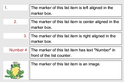
Alternatively, the ::marker pseudo-element can be used to style the list item marker, giving full control over its content, width, alignment and so on.
CSS
    li::marker { width: 2.4cm }
    li.left::marker { text-align: left }
    li.center::marker { text-align: center }
    li.right::marker { text-align: right }
    li.text_marker::marker {
        content: "Number " counter(list-item)
    }
    li.image_marker::marker {
        content: url("../../image/prince.jpg")
    }
Output
Tables
Automatic table layout
When the automatic table layout algorithm is used, all contents of the table will be processed to determine the table width and its column width.
The automatic table layout algorithm is used in the following situations:
- by default; or
- when table
table-layoutproperty isauto; or - when table
widthproperty isauto, regardless of the value of thetable-layoutproperty.
The basic rules used by Prince can be summarized as follows:
- Uses all contents of a column to calculate its maximum and minimum width. The minimum width typically ensures that the column should be big enough to hold the widest non-breakable unit (for example, a word or an image). The maximum width typically ensures that the column should hold all cell contents without breaking line (unless an explicit line break occurs).
- If a calculated minimum or maximum column width is smaller than the corresponding specified column width, it will be replaced with the specified column width.
- If table
widthhas valueauto, and if the table fits in the container when using maximum column widths, then maximum column widths will be used. Otherwise, minimum column widths will be used, but they will be adjusted, if the sum of them is smaller than the specified the table width or the container width, so that the table can take up as much space as possible.
Fixed table layout
When the fixed table layout algorithm is used, the table column widths are determined by their specified widths or by the remaining space available, regardless of their contents.
The fixed table layout algorithm is used in the following situations:
- when the table
table-layoutproperty has a valuefixed, and - the value of
widthproperty is notauto
    table {
        table-layout: fixed;
        width: 90%
    }
Note that if the width property has value auto (which is the default value), the table-layout property will be ignored and automatic table layout will be used instead.
The basic rules used by Prince are as follows:
- If a column has a specified width, then the specified width is used as its minimum width.
- For columns that do not have specified widths, the remaining space (specified table width - sum of all the specified column widths) is evenly divided among them as their minimum widths.
- If the sum of all the minimum column widths is smaller than the specified table width, they will be adjusted to eat up the remaining space.
Separated table borders
When the border-collapse property is set to separate, a table can have separate borders around individual cells. The space between table cell borders is determined by the value of its border-spacing property.
CSS
    table {
        border-collapse: separate;
        border-spacing: 5px;
        border: solid 3px black
    }
    td { border: solid 1px red }
    td.dash-blue  { border: 2px dashed blue }
    td.solid-green { border: 2px solid green }
Output
| A | B | C |
| D | E | F |
| G | H | I |
Note that by default,
the value of border-collapse is
separate.
Collapsing table borders
When the CSS property border-collapse is set to collapse, each edge of each cell resolves its final border style and border width based on certain rules.
CSS
    table {
        border-collapse: collapse;
        border: solid 3px black
    }
    table td { border: solid 1px red }
    td.dash-blue  { border: 2px dashed blue }
    td.solid-green { border: 2px solid green }
Output
| A | B | C |
| D | E | F |
| G | H | I |
Note that the border-spacing property is not used
in the collapsing table border model.
The rules used by Prince for choosing the "winner" border are as follows:
- If a border has a border style of
hidden, it beats those with other border styles; - Otherwise, if a border has a border style of
none, it loses to those with other border styles; - Otherwise, if a border has thicker border width, it beats those with thinner ones;
- Otherwise, a border wins if its border style has higher precedence. The precedence order is:
solid,dashedthendotted; - Otherwise, a border wins if it is set in a part that has higher precedence. The precedence order is: cell, row, row-group then table.
Cells that span columns
Prince table cells that span multiple columns using the table-column-span CSS property, which takes an integer value and is set to 1 by default.
CSS
td.colspan2 { table-column-span: 2 }
XML
<td class="colspan2"> B </td>
Output
| A | B | |
| C | D | E |
Cells that span rows
Prince supports table cells that span multiple rows using the table-row-span CSS property, which takes an integer value and is set to 1 by default.
CSS
td.rowspan2 { table-row-span: 2 }
XML
<td class="rowspan2"> A </td>
Output
| A | B | C |
| D | E |
Numbering table rows
If you want to number table rows in a table, but there are just too many rows to number by hand, or if the document is dynamically generated and hand numbering is impossible, CSS counters and generated content can help you out:
CSS
    table { counter-reset: row }
    tr { counter-increment: row }
    tr::before {
        content: counter(row);
        display: table-cell
    }
HTML
    <table>
    <tr><td>The First Table Row</td></tr>
    <tr><td>The Second Table Row</td></tr>
    <tr><td>The Third Table Row</td></tr>
    </table>
Output
| 1 | The First Table Row |
| 2 | The Second Table Row |
| 3 | The Third Table Row |
As pseudo-elements only inherit inheritable properties from the element they are attached, non-inheritable properties, such as display and border properties, need to be explicitly set in the pseudo-elements.
Running table headers and footers
When a table spans across more than one page, it might be desirable to have a "running" table header and footer so that they can be carried on to all the subsequent pages on which the table appears.
HTML
    <table>
      <thead>
        <tr> <td>Name</td> <td>Mark</td> <td>Grade</td> </tr>
      </thead>
      <tr> <td>Xuehong</td> <td>95</td> <td>H1</td> </tr>
      <!-- other rows for other students -->
      <tfoot>
        <tr> <td>Name</td> <td>Mark</td> <td>Grade</td> </tr>
      </tfoot>
    </table>
Rows inside the thead element are used as a running table header.
Rows inside the tfoot element are used as a running table footer.
See also Long Tables.
Table captions
Tables can also be provided with a table caption by using the caption HTML element, or by styling an arbitrary element with display: table-caption to be made to behave like caption elements. The caption is positioned above the table by default, but it can be moved to the bottom with the caption-side property.
When a table spans across more than one page, the -prince-caption-page property determines whether table captions will be displayed on the first page of a table, or only on the following pages, or repeated on every page that a table appears on. See also Fancy Table Captions.
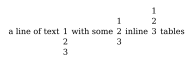
Inline tables
Tables can also appear as inline elements in running text - to do so, use display: inline-table.
Vertical alignment of these inline tables can be defined with the property table-baseline, which is used to define which table row is treated as the baseline for the vertical alignment.
CSS
    .inline { display: inline-table; }
    td { vertical-align: baseline; }
HTML
    <div>
      a line of text
      <table class="inline" style="table-baseline: 1">
        <tr><td>1</td></tr>
        <tr><td>2</td></tr>
        <tr><td>3</td></tr>
      </table>
      with some
      <table class="inline" style="table-baseline: 2">
        <tr><td>1</td></tr>
        <tr><td>2</td></tr>
        <tr><td>3</td></tr>
      </table>
      inline
      <table class="inline" style="table-baseline: 3">
        <tr><td>1</td></tr>
        <tr><td>2</td></tr>
        <tr><td>3</td></tr>
      </table>
      tables.
    </div>
Output
Columns
Reading long lines of text can be difficult - multiple columns have been used in print for a very long time. CSS allows for clean styling in multiple columns with the help of several properties.
The column-count property specifies the number of columns for the selected element - the column width will be calculated automatically. Alternatively, you can define the (optimal) width of a column with the column-width property, and the number of columns will be defined automatically. Note that Prince might make small adjustments to the actual width in order to use the available space at its best. Both values can also be set simultaneously with the shorthand columns property.
    p {
        column-count: 3;
    }
The height of the columns is balanced by default, and the text is distributed to the available columns so that the height of the content in each column is approximately equal. In some situations it might be desirable to explicitly determine the height of the columns, creating as many columns as necessary. This is achieved by setting the height or max-height properties on a multi-column block.
With the column-gap property the distance between columns can be styled and the column-rule property allows the addition of a line between columns - this is similar to using border-left or border-right properties.
    p {
        column-gap: 2em;
        column-rule: red dotted thin;
    }
The column-fill property determines how the content is distributed to fill various columns: the property can be set to auto, filling the columns sequentially, or balance, dividing the content in equal ways between the columns.
When content is laid out in multiple columns, Prince can determine where column breaks are placed in a similar way to breaking content into pages. Use the properties break-before and break-after with the value column to fine tune this behavior.
Prince also supports the properties column-break-before and column-break-after. However, you are encouraged to use the newer properties break-before and break-after with the keyword column from the CSS Fragmentation Module Level 3.
If an element is to break the flow and span several columns, the property column-span helps to achieve this. For floated elements (see Floats) a numeric value tells Prince how many columns the element should span. A numeric value other than 1 will only affect floated elements.
The following example instructs Prince to make the h1 heading element span all the columns:
    body {
        column-count: 3;
    }
    h1 {
        column-span: all;
    }
Please note that starting with Prince 14, Prince treats a non-multi-column layout as a single column layout.
Floats
When printed texts contain images, the text is usually laid out to wrap around those images. To accomplish the same with CSS, the images are floated - either to the left or right of text, or at times even to the top or to the bottom of a column. The float property does just this - it floats an element, allowing the content of other elements to flow around it.
    img {
        float: right;
    }
The property clear can be considered the float's sister property: an element that has the clear property set on it will not move up, next to the floated element, like the float is asking for. Instead, it will move down after the float.
Prince extends the traditional behavior of floats with a few features that have been ubiquitous in printing for a long time. In addition to the following documentation, the quick guide to page and column floats in Prince 14 provides many more examples for float, clear and defer properties.
Prince Extensions to Floats
Traditionally, floats move in the inline direction, left or right. Prince extends this behavior with page and column floats that move in the block direction, specifying that an element should be floated to the top, to the bottom, or to the nearest edge of a page or of a column.
This allows for more flexible layout options that meet the needs of formatting documents for print.
Prince's implementation of float differs from the standard implementation under the hood: it really is a shorthand for the following properties:
The values for where to float an element to, which traditionally are assigned with the property float, are now defined by the property -prince-float-placement. However, when using the shorthand float, no difference to the standard implementation can be noticed.
Thus, the following two examples achieve exactly the same when used in a multi-column page:
    img {
        float: right;
    }
    img {
        -prince-float-reference: column;
        -prince-float-placement: right;
    }
Please keep in mind that starting with Prince 14, Prince treats a non-multi-column layout as a single column layout. The default reference context for a float is column. In most cases this should be of no concern for users. However, in some corner cases this might lead to unexpected consequences.
All float-related properties have our vendor prefix -prince-, since they differ from the standard. When using standard values in our documentation, we use the form without prefix:
    img {
        float: right;
    }
However, when using a non-standard value, we use the form with prefix:
    img {
        -prince-float: top;
    }
Page and Column Floats
When giving the -prince-float property the value top or bottom, the element will be floated to, respectively, the top or the bottom of the column or page - the correct reference context for the float is defined through the -prince-float-reference property.
    img {
        -prince-float: top;
        -prince-float-reference: page;
    }
Note that from Prince 14 onwards, the element will by default be floated to the top or bottom of the column it appears in. This should mostly work as intended, since a normal page can be considered simply as a layout with one column! However, earlier implementations of page floats with the float property would float to the top of a page also in a multi-column layout. If the previous behaviour is the desired one, the following style rule needs to be added to your stylesheet:
* { -prince-float-reference: page; }
The value top-bottom tries to float the element to the top of the reference context (i.e. a column or a page), and if that should not be possible, it is floated to the bottom.
Note that when setting only the value for -prince-float-reference in the shorthand property -prince-float, i.e. column or page, the default value for -prince-float-placement is top-bottom and differs from its initial value! This means that Prince will try to float the element to the top of the indicated float reference, and if that should not be possible, it would be floated to the bottom.
    img {
        -prince-float: page;
    }
The value snap instructs Prince to float the image to the nearest end, which could be either the top or bottom of the page or column.
    img {
        -prince-float: snap;
    }
A floated element in a multi-column context can span several columns with the help of the column-span property (see Columns). The following example, when used in a multi-column layout with two columns, instructs Prince to make the image span all columns:
    img {
        -prince-float: top;
        column-span: 2;
    }
A similar result can be achieved by specifying the page as a float reference:
    img {
        -prince-float: page top;
    }
However, there is an important difference: an image with column-span: all will stay within its parent element, but an image with the page defined as a float reference will escape its parent and align itself with the page area, as can easily be seen in this example.
Page and Column Float Order
Floating elements can sometimes appear in a different order than the source order - to exactly control the order, Prince provides the property -prince-float-policy. The value in-order tells Prince to always show the floated elements in the order in which they were defined in the source, while the value normal makes them appear in the processing order.
The following example will float both figures to the bottom, and the figure with class one will float above the one with class two:
HTML
    <figure class="one"></figure>
    <figure class="two"></figure>
CSS
    figure {
        -prince-float: bottom;
        -prince-float-policy: in-order;
    }
Would the in-order directive have been omitted, the figure with class two would have been floated above the one with class one.
Dropping Excess Floats
The property -prince-float-tail instructs Prince how to deal with page floats that end up past the end of normal content: with the value fill-page, Prince will try to fill the last page, but discard any page floats that would create more pages. The value keep will keep all images and create enough new pages to accomodate them all.
Margins of Page and Column Floats
Margins in vertical flows are a powerful styling tool. Setting a vertical margin to the value auto will expand, and thereby repel other content - setting both top and bottom margins to auto will vertically center the element!
    img {
        -prince-float: top;
        margin: auto 0;
    }
See also this example for repelling other content from column floats.
When elements snap to the nearest edge, it is impossible to predict whether they end up at the top or at the bottom. Therefore Prince offers a way to specify an alternative margin value for the vertical margins with the property -prince-margin-alt.
    img {
        -prince-float: snap;
        margin: 1em 0;
        -prince-margin-alt: 0;
    }
Spread Floats
In print one typically has to deal with left facing and right facing pages, together forming a spread. To take this into account when placing an element, Prince extends the float property with the values inside and outside, moving the element respectively to the inside or outside of a spread.
If the inside and outside values are used in a multi-column layout, by default the element is floated to the inside or outside of the column it appears in its natural flow. To change this behaviour, the page float reference needs to be specified:
    img {
        -prince-float: page inside;
    }
Deferring Floats
Floats can be deferred, to be laid out at a later position. The properties -prince-float-defer-column and -prince-float-defer-page are used to defer the float to, respectively, some other column or page.
Page and Column Footnotes
The value footnote transforms the element into a footnote: it creates a footnote call in the place where it appears in its natural flow, and moves the element to the bottom of the column - please note that a normal page is considered to be a single column layout. The footnote marker is placed outside of the block of the footnote. With the value inline-footnote, the footnote marker is placed inside of the block of the footnote. To move the footnote to the bottom of a page in a multi-column layout, instead of to the bottom of its column, the correct float reference needs to be defined with the -prince-float-reference property. See also Footnotes.
Please also consult A quick guide to creating footnotes in Prince for more examples and complex applications of footnotes.
Sidenotes and wide floats
Prince offers experimental support for allowing elements to be floated into a predefined sidenote area, left or right of the main page area, with the sidenote value. Within that region, they can be placed at the top or the bottom, or be aligned in different ways with their natural anchoring points. For more details see Sidenotes.
Wide floats allow elements to extend into sidenote areas. This is achieved with the value wide of the -prince-float-reference CSS property, which will display an element in its natural position and allow it to extend into all available sidenote areas. If you want to limit it extending into just one sidenote area, the behaviour can be finde-tuned with the values wide-left, wide-right, or wide-inside and wide-outside.
Please note that wide floats are being laid out before other sidenotes, thus "reserving" the space taken in for themselves. Further sidenote floats at the same natural anchoring point will then be stacked in the content order, as happens for regular sidenotes.
Please also consult A quick guide to creating sidenotes in Prince for more examples and complex applications of sidenotes.
Conditional Modifiers
The property -prince-float-modifier is to be used in combination with other float instructions. When used with the value unless-fit it expresses a conditional: the element is only floated if it would otherwise cause a page or column break. For example, If you have a large image that happens to occur at the end of the page, it could force a page break and leave a gap at the end of the previous page. So you could float the image with the modifier value unless-fit, which would move it to the top of the next page unless it fits on the current page without causing a break and leaving a gap:
    img {
        -prince-float-placement: top;
        -prince-float-modifier: unless-fit;
    }
Or, in shorthand notation:
    img {
        -prince-float: top unless-fit;
    }
Clearing Floats
Prince also extends the clear property with new keywords.
The values inside and outside clear inside and outside spread floats, while the keyword both clears… both.
The clear values for page and column floats are very powerful in multi-column layout. Imagine that you have a two-column layout with a first float at the top of the first column. If you create a second column float whose natural position would be just below the first one, then:
-prince-clear: endclears the float and forces the second float to the next available placement, i.e. to the bottom of the first column;-prince-clear: columnclears the column and forces the second float to the second column;-prince-clear: pageclears the page and forces the second float to the next page.
For page floats, the clear values column and page behave the same way, since Prince treats the page as a single column.
Please also see the examples for clearing page floats and clearing column floats.
Footnotes
Prince supports footnotes using the float property. If an element has the property float: footnote then it will be floated into the footnote area of the page and a reference will be placed in the text.
This example shows some simple footnotes, the .fn class is used to create footnotes:
Footnotes example
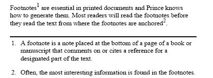
CSS
    .fn {
        float: footnote
    }
HTML
    <p>
    Footnotes<span class="fn">A footnote is a note placed at
    the bottom of a page of a book or manuscript that comments on or
    cites a reference for a designated part of the text.</span>
    are essential in printed documents and Prince knows how to generate
    them. Most readers will read the footnotes before they read the text
    from where the footnotes are anchored<span class="fn">Often,
    the most interesting information is found in the footnotes.</span>.
    </p>
Each footnote implicitly increments the footnote counter which is used to number the footnotes. The footnote counter can be reset at each new page, section or chapter as necessary. This example resets the counter on each new page.
    @page {
        counter-reset: footnote
    }
Footnote calls
Footnote calls are the numeric anchors in the text that refer to the footnotes. Prince will generate footnote calls using the ::footnote-call pseudo-element. This is the default style for footnote calls:
    *::footnote-call {
        content: counter(footnote);
        font-size: 83%;
        vertical-align: super;
        line-height: none
    }
This will display the current value of the footnote counter in a superscript position in a slightly smaller font than the main text. The line-height declaration ensures that the superscript position of the footnote does not affect the line height of the main text.
The footnote call style can be customized to use different fonts or colors. It can even be customized to include different content, such as placing the footnote counter in brackets rather than making it superscript.
    *::footnote-call {
        content: "[" counter(footnote) "]";
        font-size: inherit;
        vertical-align: inherit;
    }
This rule will generate footnote calls with the number of the footnote in brackets, like this: [1], [2], [3].
Footnote markers
Prince automatically generates footnote markers, the numeric markers placed in front of the footnote text. Footnote markers are similar to the markers added to list items (see Lists) in most respects, and can be styled in a similar fashion using the ::footnote-marker pseudo-element:
    *::footnote-marker {
        font-weight: bold
    }
This rule will generate footnote markers with a bold font.
Footnote markers are rendered outside the footnote in the left margin area by default. If the CSS property footnote-style-position has value inside, the marker is rendered as the first inline box inside the footnote. This property is similar to the list-style-position property that applies to list markers (see Lists).
Styling and behavior of footnotes
Footnotes are placed within the @footnote area of the page (see Page regions), which can be styled within @page rules.
    @page {
        @footnote {
            border-top: solid black thin;
            padding-top: 8pt
        }
    }
This rule adds a border and some padding to the top of the footnotes area.
If there are no footnotes on a page, the footnotes area will not be displayed on that page at all.
By default, the @footnote area is at the bottom of the page. However, Prince allows to position the area in different places, effectively offering an alternative mechanism to creating simple sidenotes (see however Sidenotes below).
    @page {
        @footnote {
            position: absolute;
            left: 10px;
        }
    }
This rule moves the footnotes area to the left side of a page.
Footnotes are created with the float property (see also Floats): an element can be removed from the normal flow of the document by styling it with the footnote value. This creates a footnote call in the place where the element would be in its natural flow, and moves the element's content to the bottom of the page. The footnote marker is rendered outside the footnote in the left margin area, and the footnote is displayed as a block element.
The property footnote-display can be used to change the default display of footnotes: besides the default block display, they can be also treated as inline elements. The value compact leaves it up to Prince to determine whether to display the footnote as a block or inline element: if two or more footnotes fit on one line, they will be treated as inline elements to take up less space.
Making a footnote into an inline element moves the footnote marker into the footnote box as the first inline box inside the footnote.
The -prince-float property offers also the value inline-footnote, which is another mechanism to transform the footnote into an inline element.
Please note that from Prince 14 onwards, the footnote will by default be floated to the top or bottom of the column it appears in! In a multi-column layout, footnotes are thus rendered by default at the bottom of each column! To float them to the bottom of the page, as was previous behaviour, the correct float context needs to be defined with the -prince-float-reference property. See also Page and Column Floats.
In some situations it might happen that footnotes do not fit on the page on which the footnote call was placed. It might be desirable to tie the footnote to the same page as the call - the property -prince-footnote-policy can be of help. The following example instructs Prince to move the line with the footnote call to the next page, in order to keep it on the same page as the footnote itself:
    p {
      -prince-footnote-policy: keep-with-line;
    }
Alternatively, the value keep-with-block moves the entire paragraph to the next page.
This property must be applied to the paragraph in which the footnote occurs, not to the footnote element itself.
Please also consult A quick guide to creating footnotes in Prince for more examples and complex applications of footnotes.
Sidenotes
Prince offers experimental support for sidenotes using extensions to the float property. If an element has the property -prince-float: sidenote then it will be floated into the sidenote area of the page - think of it like a float to the left or to the right, yet into a predefined area. Sidenotes are thus not automatically numbered the way footnotes are.
A sidenote area needs to be first defined as an @page region.
    @page {
        @rightnote { width: 40vw; }
    }
To float the note to the sidenote area, the -prince-float-reference property is used with the value sidenote.
    note {
        -prince-float-reference: sidenote;
    }
If two sidenote areas are defined as @leftnote and @rightnote, you need to specify into which area to float your note - by default (that is, if you do not specify whereto to float) it will be floated to the "start" as defined by CSS, i.e. to the left for English, and to the right for traditional Chinese.
For page spreads, the sidenote areas @insidenote and @outsidenote can be defined.
    note.left {
        -prince-float-reference: leftnote;
    }
    note.right {
        -prince-float-reference: rightnote;
    }
By default, sidenotes appear near their natural anchoring points - the top of the sidenote will be aligned with the top of the box where it naturally appears. This is expressed by the value align-top of the -prince-float-placement property. If more than one sidenote naturally appears on the same line, the sidenotes will be stacked in the content order. The value align-bottom is used to align the bottom of the sidenote with the top of the box where it naturally appears.
    note {
        -prince-float-reference: rightnote;
        -prince-float-placement: align-bottom;
    }
Alternatively, sidenotes can also be floated to the top, or to the bottom within the sidenote area.
    note {
        -prince-float-reference: rightnote;
        -prince-float-placement: top;
    }
Please note that this affects also the stacking order: if sidenotes are floated to the top, subsequent notes will be naturally stacked below the first note. If however they are floated to the bottom, subsequent notes will be stacked above the previous notes!
The property -prince-float can be used as a shorthand:
    note {
        -prince-float: rightnote top;
    }
Elements can also not be entirely moved into a sidenote area, but just extend into a sidenote area - for details see Sidenotes and wide floats.
Please also consult A quick guide to creating sidenotes in Prince for more examples and complex applications of sidenotes.
Flex Layout
Flex layout is a layout model similar to the block layout. It lacks Columns and Floats but gains powerful possibilities to distribute space and align content in a more flexible way. The content of a flex container can alter its height and width to best fill the available space, it can be easily aligned even if the size is unknown or dynamic, and most importantly it can be laid out in any direction, as opposed to the traditional layout models that would either be vertically-based (block layout) or horizontally-based (inline layout).
Prince supports the Flex specification fully, with some limitation regarding page-breaking multiple row/column flex containers.
In Flex layout some properties apply to the parent element, i.e. to the flex container, while others apply to the children, or flex items.
Flex Containers
To use the flex layout, flex needs to be enabled on the parent element to create the flex container by defining the flex value for the display property.
    .flexcontainer {
        display: flex;
    }
Next, the direction of the flex layout can be defined by means of the flex-direction property: rightwards, leftwards, downwards, or even upwards! With the flex-wrap property the wrapping of the flex container is controlled - the default is to try to arrange all items on one line. The shorthand property flex-flow can be used to define flex-direction and flex-wrap together.
    .flexcontainer {
        display: flex;
        flex-flow: row wrap;
    }
The property justify-content defines the alignment of the content along the main axis - extra free space can be distributed in various ways after or before the content, or in specific ways between the flex items. The alignment along the cross axis is controlled with the align-items property. In case there are multiple item lines in a flex container, the alignment of the lines can be controlled with the align-content property. If there is only one line, the property has no effect.
Flex Items
By default, items are placed in the source order inside a flex container, but with the order property it can be modified!
    .flexitem1 {
        order: 2;
    }
    .flexitem2 {
        order: 1;
    }
    .flexitem3 {
        order: 3;
    }
The flex-grow property defines the proportion by which a flex item can grow, if necessary, while flex-shrink defines the proportion by which an item can shrink. The flex-basis property defines the default size of an element, before the remaining space is distributed. However, it is recommended to use the shorthand property flex instead - the value for the flex-grow is mandatory, the other properties are automatically set in an intelligent way.
    .flexitem {
        flex: 2;
    }
Finally, the property align-self allows the default alignment specified with the align-items property to be overridden for individual flex items.
It is important to know that margins of flex items behave in a slightly special way: margins of adjacent flex items do not collapse, and using the keyword auto for the margins of a flex item will automatically distribute the available space equally around the item - and it will be centered in both axis!
Percentage values of margins and paddings of flex items are resolved by Prince against the inline axis, i.e. left/right/top/bottom percentages all resolve against width.
Custom properties (CSS variables)
Complex designs often have very large amounts of CSS with a lot of repeated values. The same color might for example be used in hundreds of different places, requiring a global search-and-replace if that color needs to be changed. Prince supports custom properties, which allow a value to be stored in one place, then be referenced in all other places.
The custom properties are set by using the custom property notation, which requires the use of two dashes (--) before the custom property name - a good approach is to set this property on the :root pseudo-class (see Tree-Structural pseudo-classes). It is then accessed in other places by using the var() function (see CSS Functional Expressions).
Unlike other CSS properties, custom property names are case-sensitive.
    :root {
      --main-text-color: black;
    }
    p {
      color: var(--main-text-color);
    }
When a fallback value needs to be provided, this can be indicated in the var() function.
    p {
      color: var(--main-text-color, brown);
    }