This booklet helps you understand the current and future color notations (Color notations are different ways to write down colors in your CSS code.) in CSS.
The aim is to teach you all different color notations available in CSS. Tell you whether the browsers support these notations already and show you some code examples.
The color spaces (Color spaces are organizations of colors. A color space may define color swatches, like Pantone. Or have a more mathematical notation like sRGB or CMYK.), which CSS uses in these different ways to express colors are not part of this booklet. In some places I mention them but do not explain any color space in detail.
To make full use of this booklet, all you need to know is how to create an HTML tag and apply CSS to it. All the different color options you will learn here!
Most of the CSS colors are in the sRGB (sRGB (standard RED GREEN BLUE) is an RGB color space created to for the use on monitors and the web.) color space, except Lab and LCH, where the computed value is a CIELab
(The CIELAB color space defined by the International Commission on Illumination (CIE).) color. Not to forget the new color() function. This makes it possible to pass your own or predefined color profiles!
All these color notations offer an optional parameter for the alpha value. The alpha value indicates how transparent the color is. In the booklet, there is an extra section in each chapter that shows how to use the alpha values.
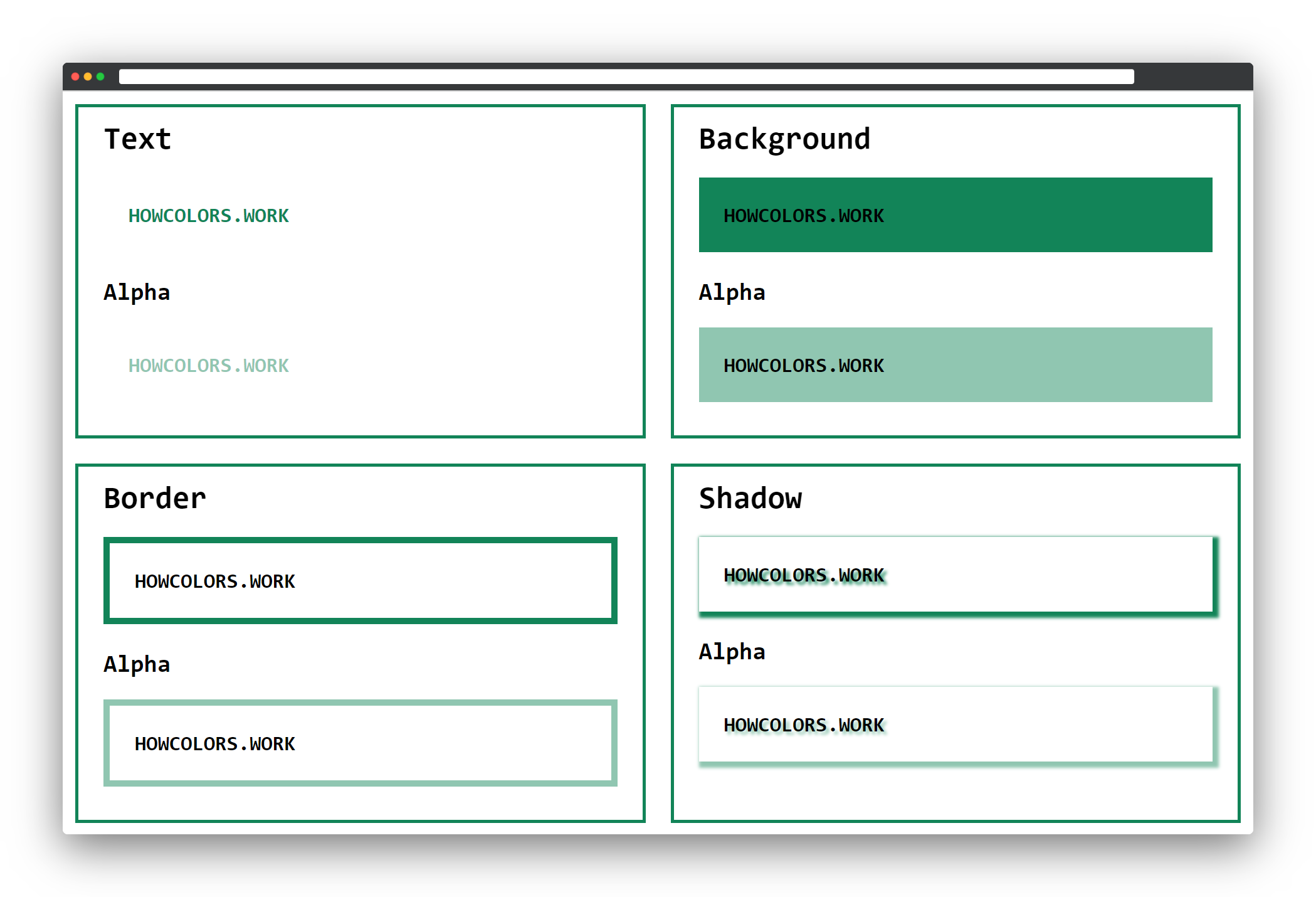
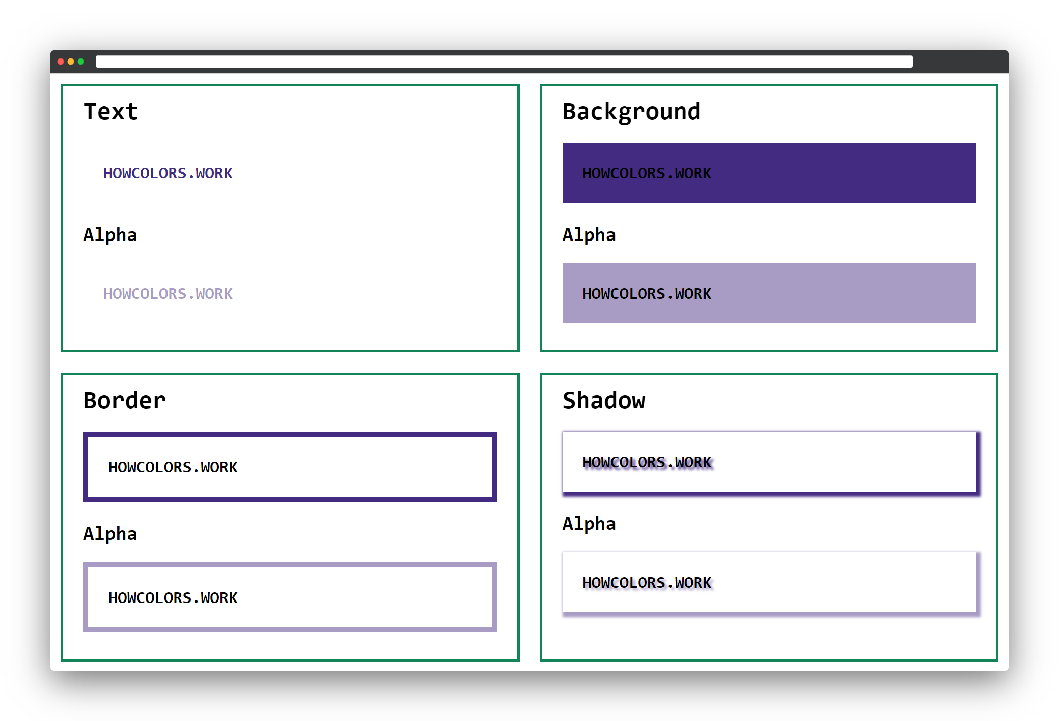
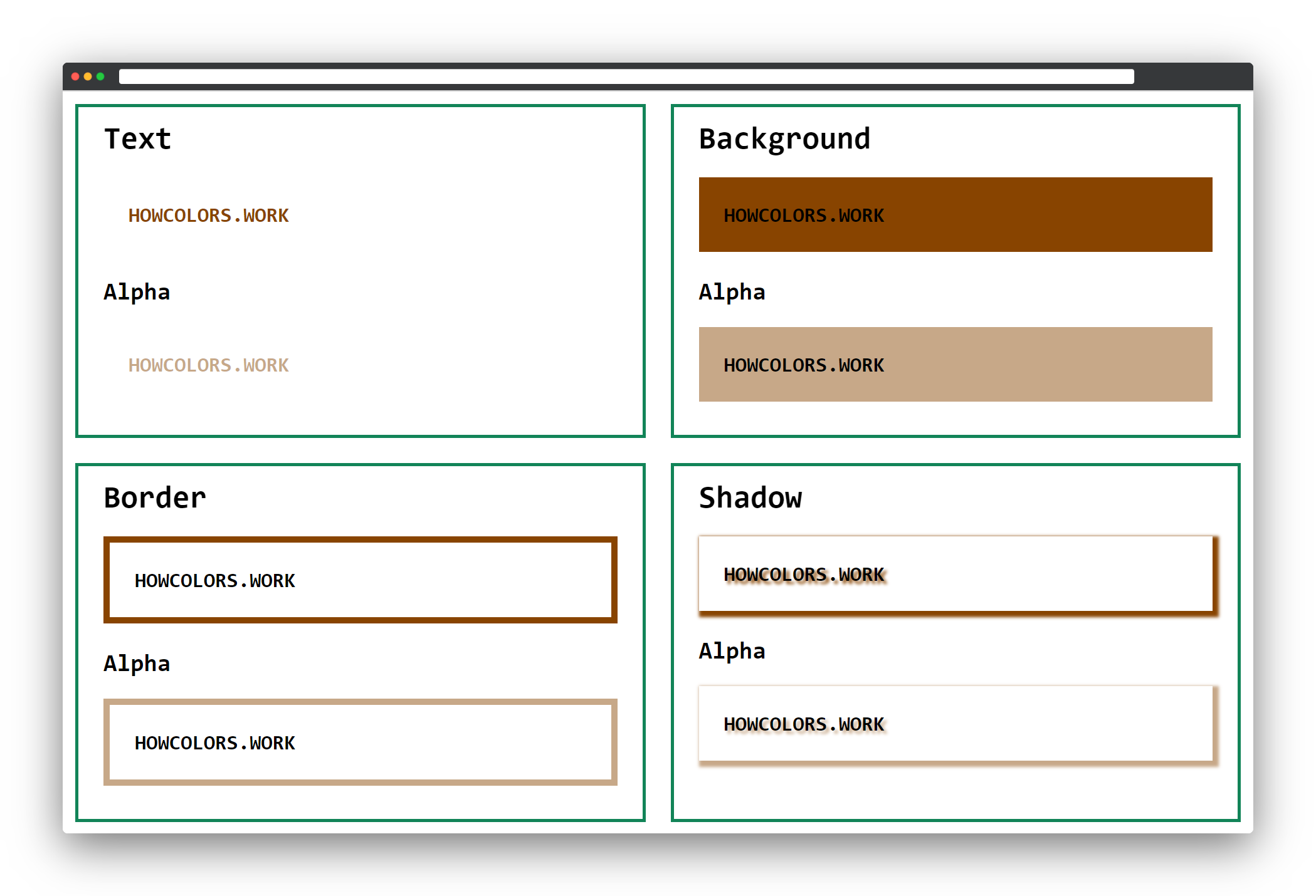
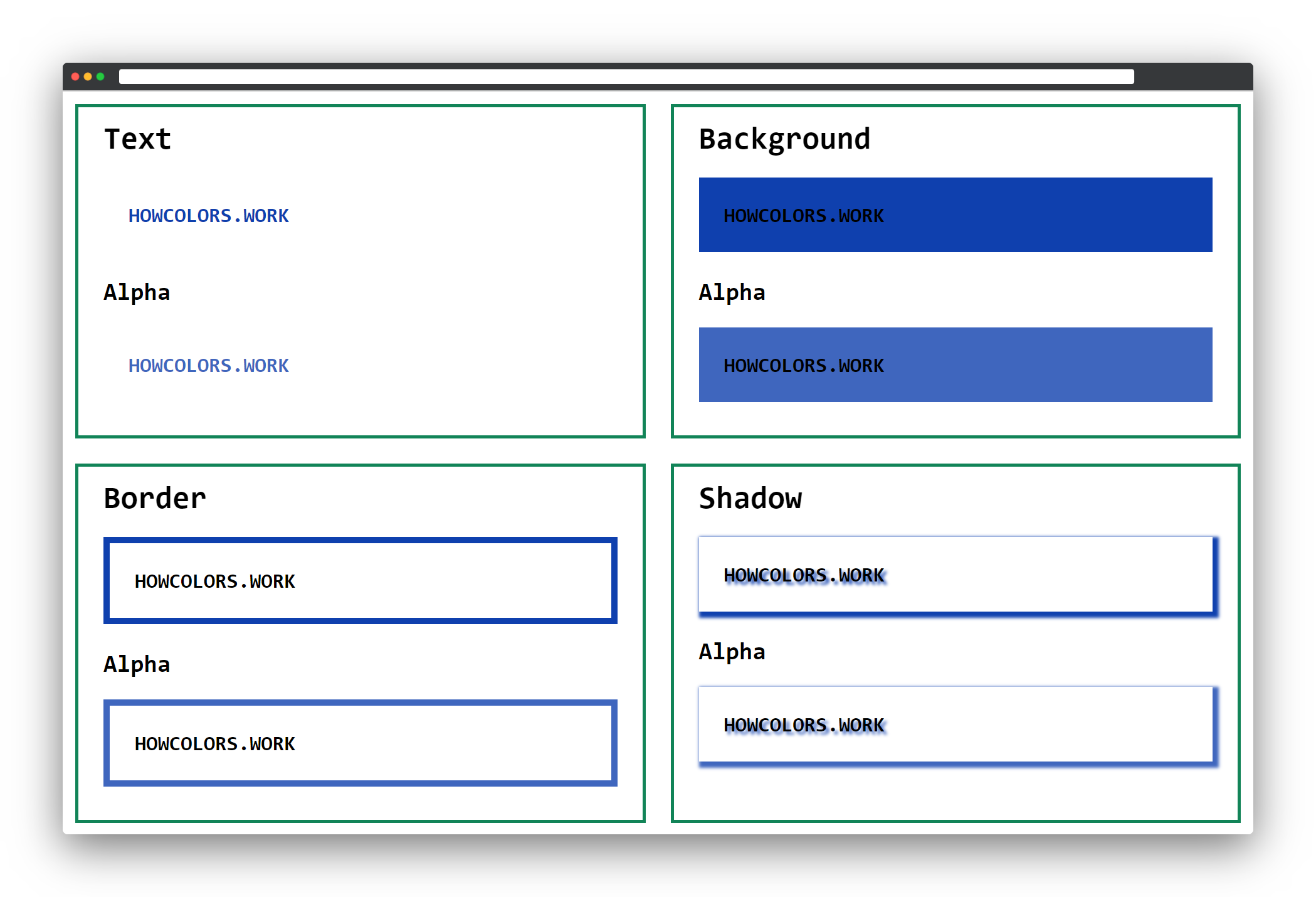
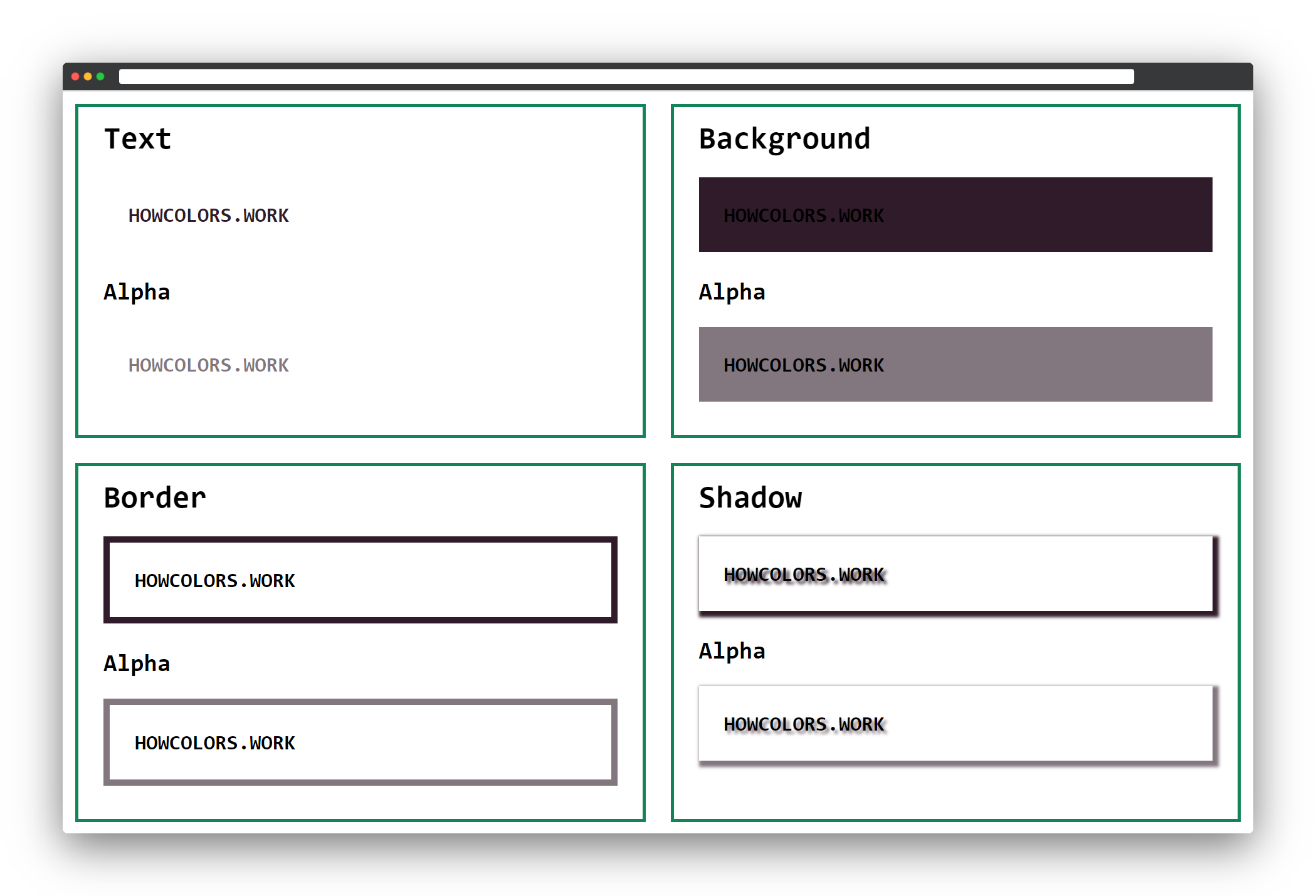
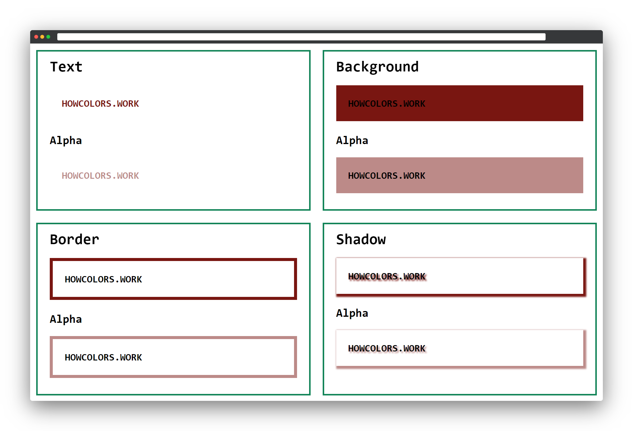
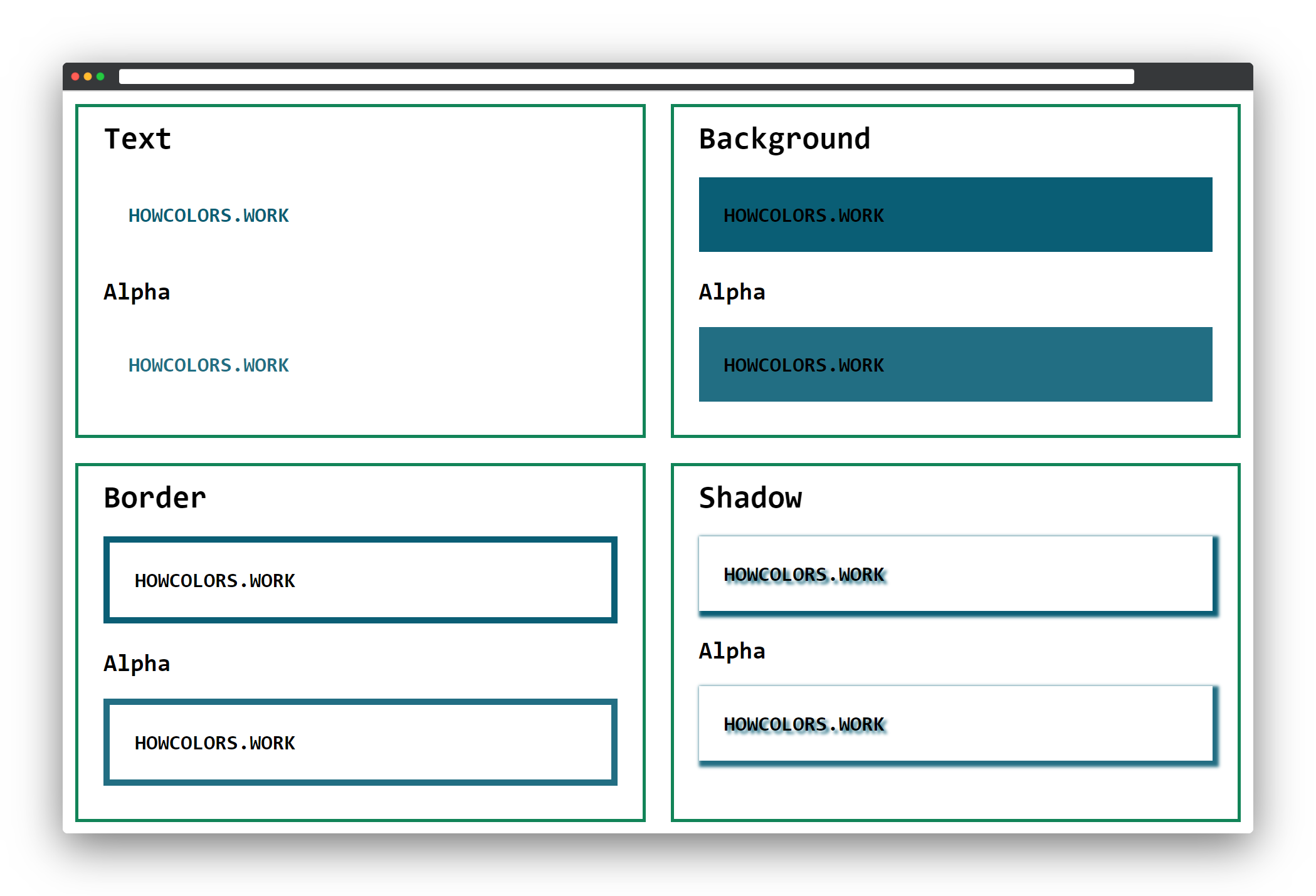
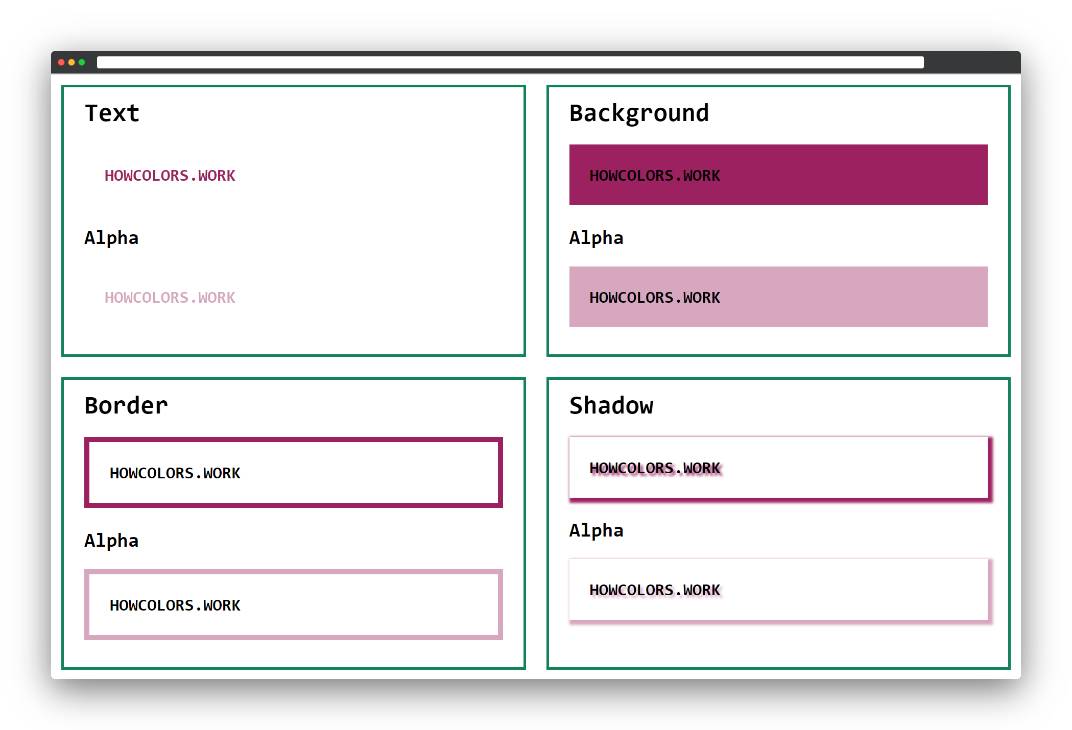
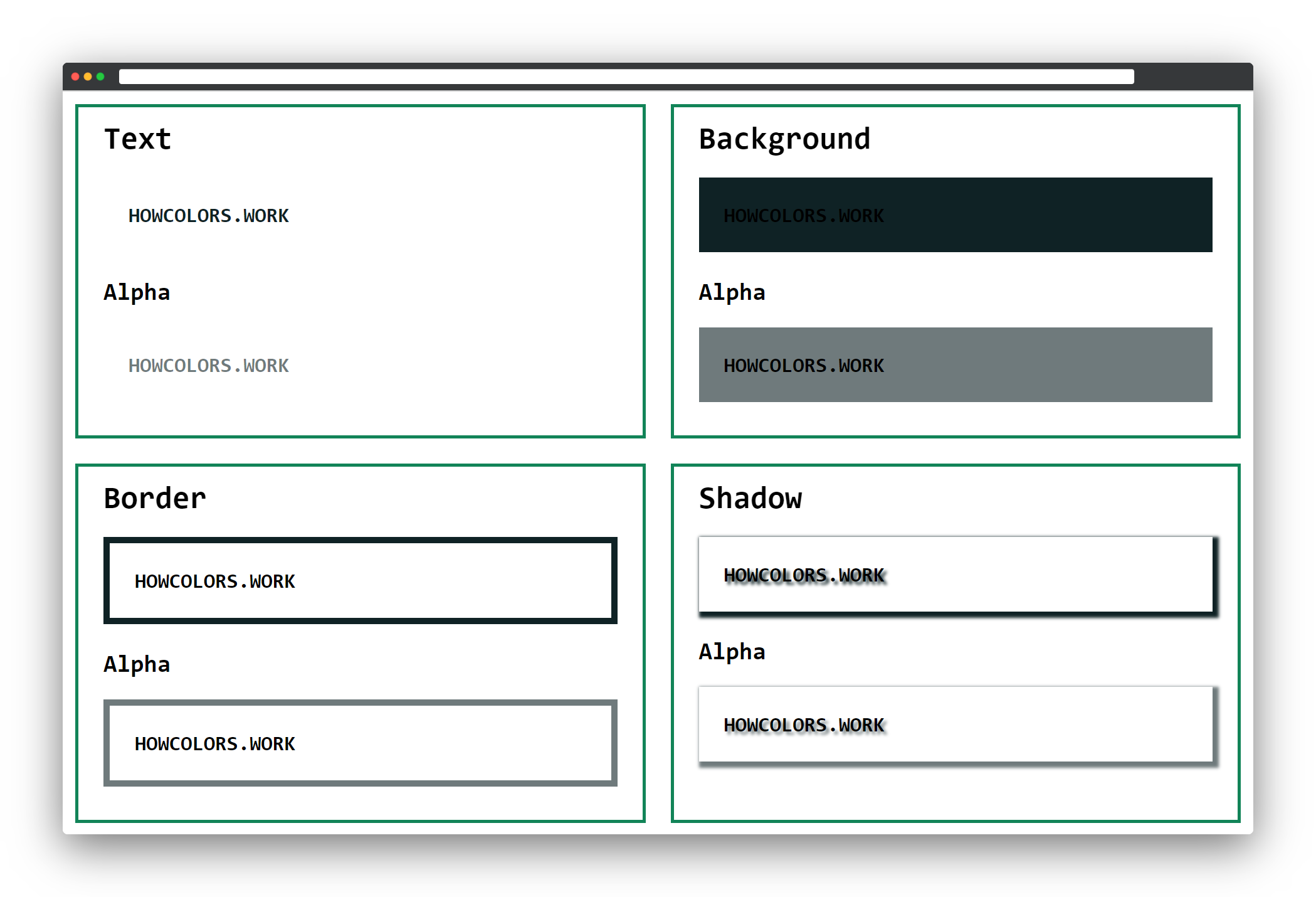
All the examples in this booklet use the same HTML structure. To make the examples look nice, I added a simple CSS grid and some basic formatting. The colors I define as CSS variables on the top.
  1 <!DOCTYPE html>
  2 <html>
  3   <head>
  4     <style>
  5         :root{
  6             --color:#128458;
  7             --color-alpha:#12845877;
  8         }
  9
 10         body{
 11             font-size:20pt;
 12             font-family:monospace;
 13             margin:1rem;
 14         }
 15
 16         h2{
 17             margin:0;
 18         }
 19
 20         h3{
 21             margin:0;
 22             margin-top:2rem;
 23         }
 24
 25         p{
 26             padding:2rem;
 27             font-weight:bold;
 28         }
 29
 30         .grid{
 31             display: grid;
 32             grid-template-columns: repeat(auto-fill,minmax(640px,1fr));
 33             grid-gap:2rem;
 34         }
 35
 36         .grid div{
 37             border:4px solid #128458;
 38             padding:2rem;
 39             padding-top:1rem;
 40             padding-bottom:1rem;
 41         }
 42
 43         .textsample{
 44             color:var(--color);
 45         }
 46
 47         .textsample_alpha{
 48             color:var(--color-alpha);
 49         }
 50
 51         .bgsample{
 52             background-color:var(--color);
 53         }
 54
 55         .bgsample_alpha{
 56             background-color:var(--color-alpha);
 57         }
 58
 59         .bordersample{
 60             border:8px solid var(--color);
 61         }
 62
 63         .bordersample_alpha{
 64             border:8px solid var(--color-alpha);
 65         }
 66
 67         .shadowsample{
 68             text-shadow:4px 4px 4px var(--color);
 69             box-shadow:4px 4px 4px 4px var(--color);
 70         }
 71
 72         .shadowsample_alpha{
 73             text-shadow:4px 4px 4px var(--color-alpha);
 74             box-shadow:4px 4px 4px 4px var(--color-alpha);
 75         }
 76     </style>
 77   </head>
 78   <body>
 79     <div class="grid">
 80       <div>
 81         <h2>Text</h2>
 82         <p class="textsample">HOWCOLORS.WORK</p>
 83         <h3>Alpha</h3>
 84         <p class="textsample_alpha">HOWCOLORS.WORK</p>
 85       </div>
 86       <div>
 87         <h2>Background</h2>
 88         <p class="bgsample">HOWCOLORS.WORK</p>
 89         <h3>Alpha</h3>
 90         <p class="bgsample_alpha">HOWCOLORS.WORK</p>
 91       </div>
 92       <div>
 93         <h2>Border</h2>
 94         <p class="bordersample">HOWCOLORS.WORK</p>
 95         <h3>Alpha</h3>
 96         <p class="bordersample_alpha">HOWCOLORS.WORK</p>
 97       </div>
 98       <div>
 99         <h2>Shadow</h2>
100         <p class="shadowsample">HOWCOLORS.WORK</p>
101         <h3>Alpha</h3>
102         <p class="shadowsample_alpha">HOWCOLORS.WORK</p>
103       </div>
104     </div>
105   </body>
106 </html>
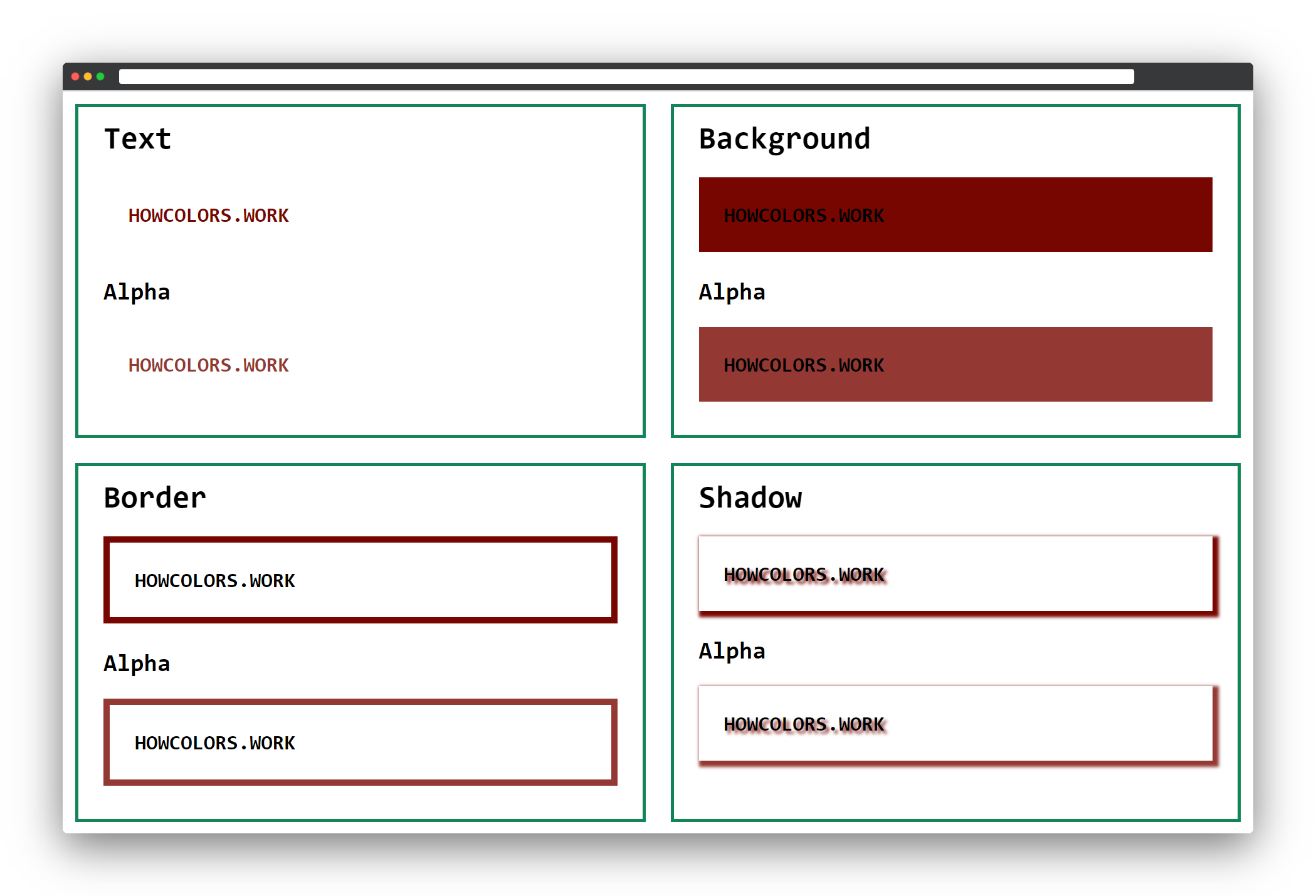
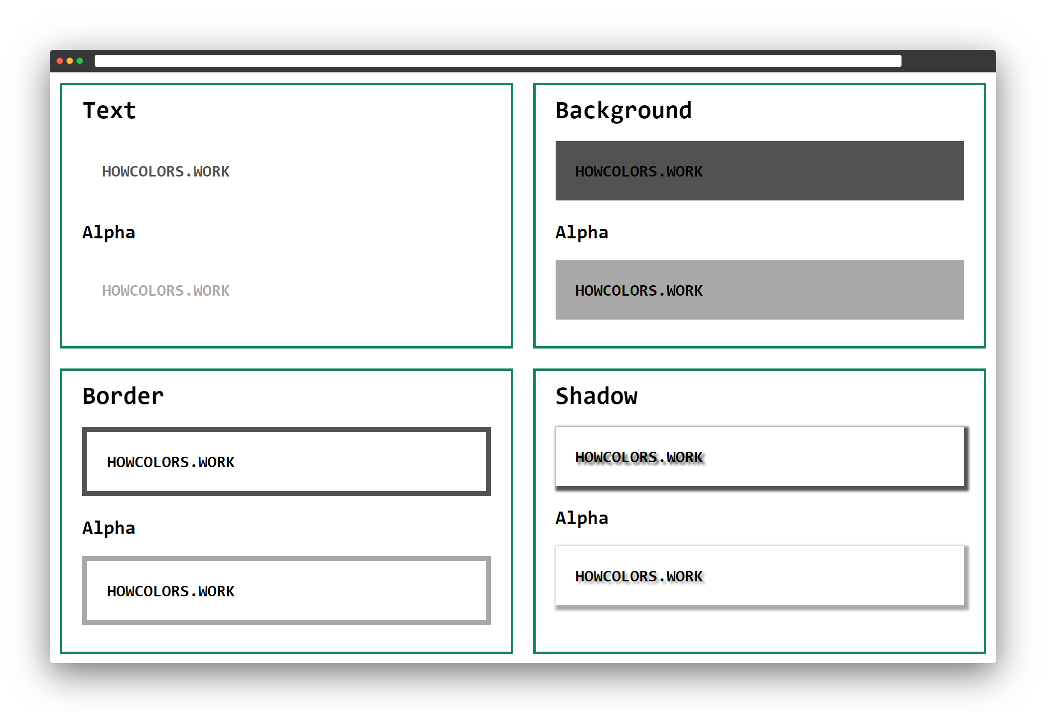
The result of this code will give you four boxes for the text, background, border, and shadow CSS examples.
In the following CSS examples, we will change the --color and --color-alpha variables. Instead of a variable as color color:var(--color); you could of course also pass the color value
color:#FF0000;.
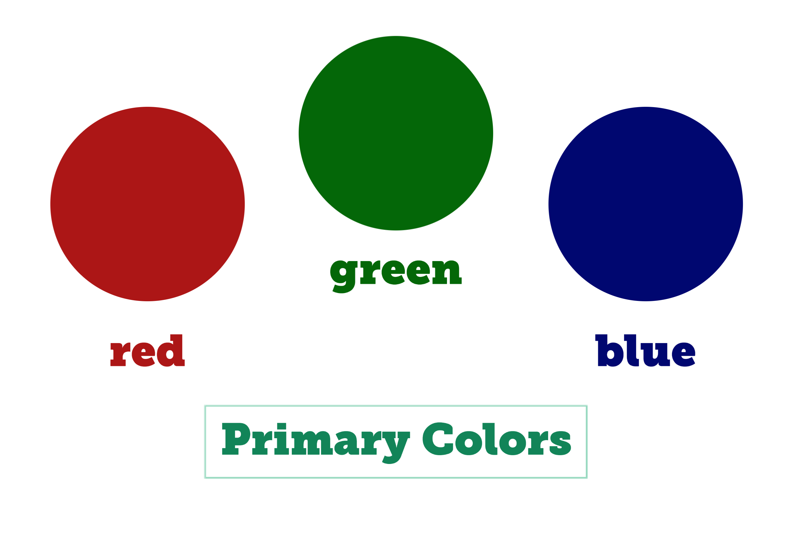
The hex color notation allows you to define sRGB colors as hexadecimal numbers. It starts with a hash #, and then you have the three primary colors, red, green and last the blue color.
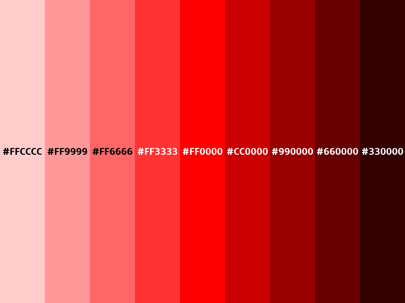
The hex notation only allows ten numerals (0-9) and six letters (a-f). Where 00 would be 0 in the RGB functional notation, and FF would be 255.
The higher the value of a primary color is, the brighter that color is. This means that the hex color #000000 has zero brightness in all three primary colors and is black. The color #FFFFFF is the
opposite as all colors have the full light, which leads to white.
#FF0000
| 1 | 2 | 3 | 4 |
|---|---|---|---|
| # | 44 | 2B | 82 |
The # indicates that the following is a hex color notation.

| 1 | 2 | 3 | 4 | 5 |
|---|---|---|---|---|
| # | 44 | 2B | 82 | 77 |
The opacity part of the color, two hexadecimal characters. Where FF = 100%, CC = 80%, 99 = 60%, 66 = 40%, 33 = 20%, and 00 = 0%.
1 :root{
2   --color:#442B82;
3   --color-alpha:#442B8277;
4 }
It is possible to use a three-digit or four-digit (including the alpha value) notation. In this short-form the single digits get doubled. So, for example, #0FC would be #00FFCC in the standard form. The
downside is you only have 4096 colors available in the short-form.

| 1 | 2 | 3 | 4 |
|---|---|---|---|
| # | 8 | 4 | 0 |
The # indicates that the following is a hex color notation.

| 1 | 2 | 3 | 4 | 5 |
|---|---|---|---|---|
| # | 8 | 4 | 0 | 7 |
The opacity part of the color, one hexadecimal character. Where F = 100%, C = 80%, 9 = 60%, 6 = 40%, 3 = 20%, and 0 = 0%.
1 :root{
2   --color:#840;
3   --color-alpha:#8407;
4 }
The hex notation, is supported in all browsers. The four and eight-digit short-form has support in all major browsers.
How many characters can a hex color have (without #)?
The hexadecimal alpha value 66 in percent?
How many colors are available in the three-digit notation?
The RGB functions build the colors from a combination of red, green, and blue. Each of these color values defines the intensity of the color as an integer value. The values range from 0 to 255 or from
0% to 100% percent. If you pass 0 to all three values you will get black, if you pass 255 to all you get white.
The computed value of the following functions is a color in the sRGB color space.
| Red | Green | Blue |
|---|---|---|
255 |
0 |
0 |
If you only set the red value to the highest possible value 255, it gives you the brightest red, which is possible.
| Red | Green | Blue |
|---|---|---|
0% |
100% |
0% |
Here only the green value is set to 100%, which gives you the brightest green possible.
| Red | Green | Blue |
|---|---|---|
0 |
0 |
255 |
The same logic applies for blue, so by setting the value to 255 and the other two values to 0, you get the brightest blue.

| 1 | 2 | 3 | 4 | 5 | 6 | 7 | 8 | 9 | 10 |
|---|---|---|---|---|---|---|---|---|---|
| rgb | ( | 15 | , | 64 | , | 174 | ) |
The function starts with an rgb.
The red value of the color can be a number or a percentage. The numbers are in the range of 0 - 255, where 255 equals 100%.

| 1 | 2 | 3 | 4 | 5 | 6 | 7 | 8 | 9 | 10 | 11 | 12 | 13 |
|---|---|---|---|---|---|---|---|---|---|---|---|---|
| rgba | ( | 15 | , | 64 | , | 174 | , | 80% | ) |
If you want to add the colors alpha value, the old syntax’s function needs to start with a rgba.
You can define the alpha (opacity) value as a number between 0 and 1 or as a percentage. For example, 1 or 100% means full opacity, while 0.5 or
50% is means half opacity.
All major browsers support the RGB functional notation.
1 :root{
2   --color:rgb(15, 64, 174);
3   --color-alpha:rgba(15, 64, 174, 80%);
4 }

| 1 | 2 | 3 | 4 | 5 | 6 | 7 | 8 |
|---|---|---|---|---|---|---|---|
| rgb | ( | 47 | 27 | 41 | ) |
Same as the old syntax, the new one starts an rgb.
An opening bracket follows the rgb.
The red value of the color can be a number or a percentage. The numbers are in the range of 0 - 255, where 255 equals 100%.

| 1 | 2 | 3 | 4 | 5 | 6 | 7 | 8 | 9 | 10 | 11 | 12 |
|---|---|---|---|---|---|---|---|---|---|---|---|
| rgb | ( | 47 | 27 | 41 | / | 0.6 | ) |
In the new syntax, the functional notation, including the alpha value, also starts with rgb.
A / as the separator between the color values and the alpha value.
You can define the alpha (opacity) value as a number between 0 and 1 or as a percentage. For example, 1 or 100% means full opacity, while 0.5 or
50% means half opacity.
The browser support for the space-separated functional color notations is excellent. All major browsers support it already. For details check caniuse.com.
1 :root{
2   --color:rgb(47 27 41);
3   --color-alpha:rgb(47 27 41 / 0.6);
4 }
Which notation is invalid?
The G in RGB stands for?
You can pass a percentage from 0 - 100%, but what is the range for integer values?
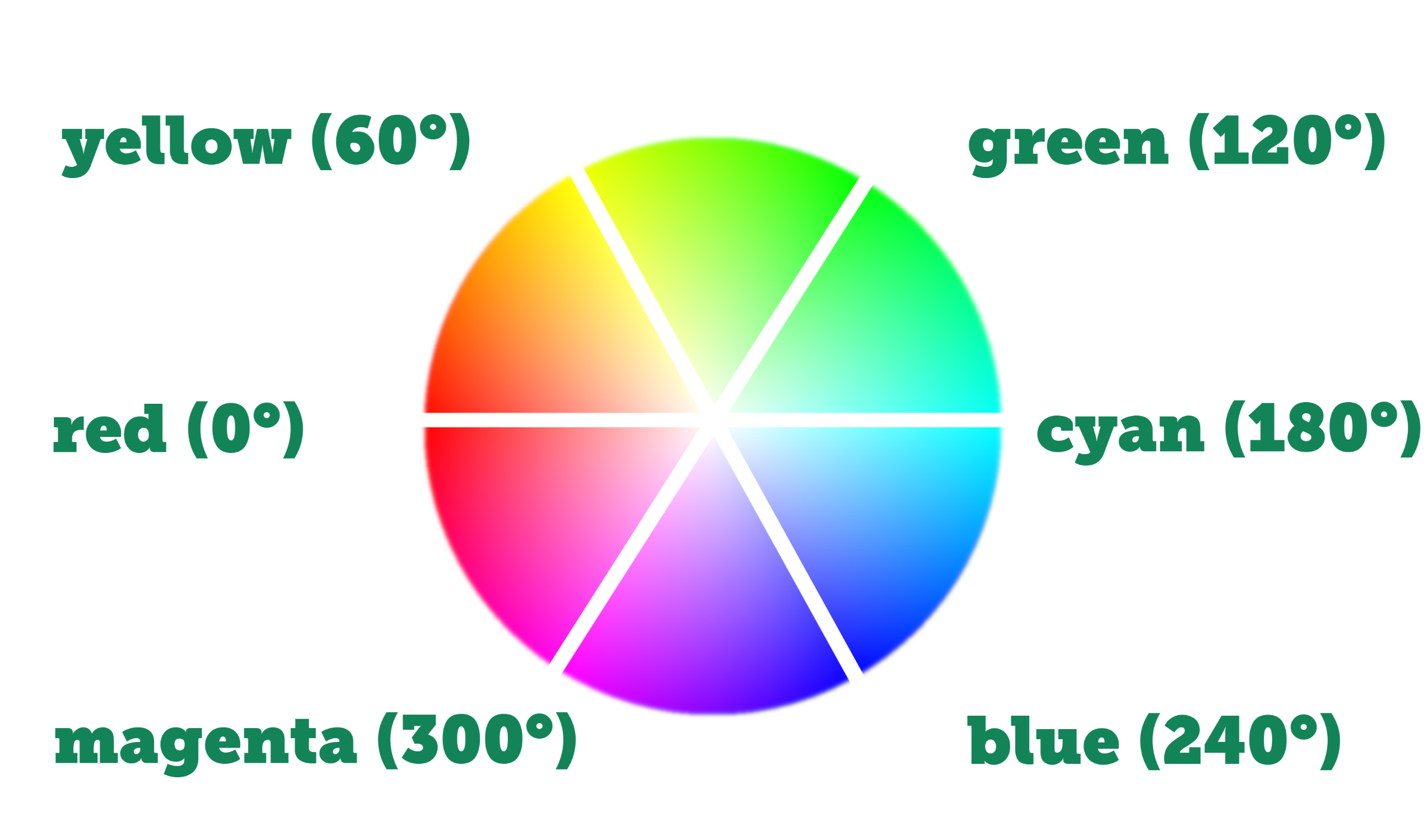
The hexadecimal and functional RGB notations are quite tricky to read and alter. The HSL functional notation is easier to read and work with. It makes it easy to, for example, get a darker version of the same hue.
The hue is an angle on the color wheel, where red equals 0 and 360 degree. Green equals 120 degree and blue 240 degree.

| 1 | 2 | 3 | 4 | 5 | 6 | 7 | 8 | 9 | 10 |
|---|---|---|---|---|---|---|---|---|---|
| hsl | ( | 3 | , | 76% | , | 27% | ) |
The function starts with an hsl.
The saturation of your color as a percentage. 100% means completely saturated, and 0% is completely unsaturated so gray.
The lightness of your HSL color, where 100% is white, and 0% lightness is black.

| 1 | 2 | 3 | 4 | 5 | 6 | 7 | 8 | 9 | 10 | 11 | 12 | 13 |
|---|---|---|---|---|---|---|---|---|---|---|---|---|
| hsla | ( | 3 | , | 76% | , | 27% | , | 50% | ) |
The function starts with an hsla.
You can define the alpha (opacity) value as a number between 0 and 1 or as a percentage. For example, 1 or 100% means full opacity, while 0.5 or
50% means half opacity.
The HSL notation is supported in all browsers. The alpha color values in the old HSLA syntax are also supported. Details you can find on caniuse.com.
1 :root{
2   --color:hsl(3, 76%, 27%);
3   --color-alpha:hsla(3, 76%, 27%, 50%);
4 }

| 1 | 2 | 3 | 4 | 5 | 6 | 7 | 8 |
|---|---|---|---|---|---|---|---|
| hsl | ( | 295 | 85% | 28% | ) |
The function starts with an hsl.
Red = 0 and 360 degree.
Green = 120 degree.
Blue = 240 degree.
In the new CSS Color Module Level 4, you could define the angle as degrees, rads, grads, or turns. For example, 1turn.
The saturation of your color as a percentage. 100% is completely saturated, and 0% is completely unsaturated so gray.
The lightness of your HSL color, where 100% is white, and 0% lightness is black.

| 1 | 2 | 3 | 4 | 5 | 6 | 7 | 8 | 9 | 10 | 11 | 12 |
|---|---|---|---|---|---|---|---|---|---|---|---|
| hsl | ( | 295 | 85% | 28% | / | .75 | ) |
The function starts with an hsl.
A / as the separator between the color values and the alpha value.
You can define the alpha (opacity) value as a number between 0 and 1 or as a percentage. For example, 1 or 100% means full opacity, while 0.5 or
50% means half opacity.
The browser support for the space-separated functional color notations is excellent. All major browsers support it already. For details check caniuse.com.

1 :root{
2   --color:hsl(295 85% 28%);
3   --color-alpha:hsl(295 85% 28% / .75);
4 }
Which notation is invalid?
The L in HSL stands for?
At which degree on the color wheel do you find blue?
The current chapter would not be complete without a mention of the color keywords. You can use these keywords besides the already covered notations.
The transparent keyword gets computed to a transparent black, like #000000 or rgb(0, 0, 0, 0).
All browsers support the transparent keyword. For details have a look at caniuse.com.
1 div {
2     background-color:transparent;
3     color:transparent;
4 }
If you use the currentcolor keyword you get the value of the CSS color: property on the current element. For example, set the color of your element to yellow. Now use the
currentcolor keyword as the background color. The browser output for this background color would also be yellow.
This keyword is also supported in all browsers.
1 div {
2     background-color:currentcolor;
3     color:yellow;
4 }
CSS has taken over some named colors from HTML and extended the list of named colors a lot. You can find a list of all named colors in the CSS Color Module. All these color names resolve to a color in the sRGB color space.
Color names are supported in all browsers.
1 div {
2     background-color:gold;
3     color:gold;
4 }
Have a look at the CSS Color Module Level 4 working draft. You can see a lot of new ways to express colors in CSS.
All these new notations only support the space-separated functional notation. So commas as separators are not allowed.
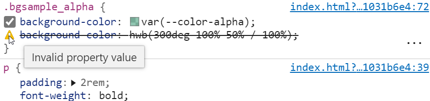
As these new formats are not supported yet, you should make a small change to the CSS. You can use the color variables as fallback colors and define the color in the new syntax in the selector.
Unfortunately, you can not use a second CSS variable here. I tested this, and the invalid color notation is not detected when it comes from a variable.
Still, in this way, you can already start defining colors with the new notations!
 1 <style>
 2     :root{
 3         /* Use these as fallbacks now */
 4         --color:#808080;
 5         --color-alpha:#808080FF;
 6     }
 7
 8     body{
 9         font-size:20pt;
10         font-family:monospace;
11         margin:1rem;
12     }
13
14     h2{
15         margin:0;
16     }
17
18     h3{
19         margin:0;
20         margin-top:2rem;
21     }
22
23     p{
24         padding:2rem;
25         font-weight:bold;
26     }
27
28     .grid{
29         display: grid;
30         grid-template-columns: repeat(auto-fill,minmax(640px,1fr));
31         grid-gap:2rem;
32     }
33
34     .grid div{
35         border:4px solid #128458;
36         padding:2rem;
37         padding-top:1rem;
38         padding-bottom:1rem;
39     }
40
41     .textsample{
42         color:var(--color);
43         color:hwb(300deg 50% 50%);
44     }
45
46     .textsample_alpha{
47         color:var(--color-alpha);
48         color:hwb(300deg 50% 50% / 100%);
49     }
50
51     .bgsample{
52         background-color:var(--color);
53         background-color:hwb(300deg 50% 50%);
54     }
55
56     .bgsample_alpha{
57         background-color:var(--color-alpha);
58         background-color:hwb(300deg 50% 50% / 100%);
59     }
60
61     .bordersample{
62         border:8px solid var(--color);
63         border:8px solid hwb(300deg 50% 50%);
64     }
65
66     .bordersample_alpha{
67         border:8px solid var(--color-alpha);
68         border:8px solid hwb(300deg 50% 50% / 100%);
69     }
70
71     .shadowsample{
72         text-shadow:4px 4px 4px var(--color);
73         text-shadow:4px 4px 4px hwb(300deg 50% 50%);
74         box-shadow:4px 4px 4px 4px var(--color);
75         box-shadow:4px 4px 4px 4px hwb(300deg 50% 50%);
76     }
77
78     .shadowsample_alpha{
79         text-shadow:4px 4px 4px var(--color-alpha);
80         text-shadow:4px 4px 4px hwb(300deg 50% 50% / 100%);
81         box-shadow:4px 4px 4px 4px var(--color-alpha);
82         box-shadow:4px 4px 4px 4px hwb(300deg 50% 50% / 100%);
83     }
84 </style>
This will give you the same result as the initial code sample. But in your developer tools, you can see a difference. The browser first tries to understand the new color syntax and after that goes to the fallback.
In the CSS examples below, you will only see the text color example. You can check other cases, like the background, here as the color notation works the same.
HWB is another functional notation to define colors, similar to HSL. The hue is an angle of 0 - 360 degrees, and values of 0% - 100% for the whiteness and blackness.
This new notation is even easier to understand then the HSL notation. That’s the reason why many color pickers, offer the possibility to select colors based on HWB.

| 1 | 2 | 3 | 4 | 5 | 6 | 7 | 8 |
|---|---|---|---|---|---|---|---|
| hwb | ( | 193deg | 4% | 54% | ) |
The function starts with an hwb.
Red = 0 and 360 degree.
Green = 120 degree.
Blue = 240 degree.
The whiteness of your color as a percentage. 100% is full whiteness, and 0% is no whiteness at all.
The blackness of your HWB color, where 100% is full blackness, and 0% no blackness at all.

| 1 | 2 | 3 | 4 | 5 | 6 | 7 | 8 | 9 | 10 | 11 | 12 |
|---|---|---|---|---|---|---|---|---|---|---|---|
| hwb | ( | 193deg | 4% | 54% | / | 90% | ) |
A / as the separator between the color values and the alpha value.
You can define the alpha (opacity) value as a number between 0 and 1 or as a percentage. For example, 1 or 100% means full opacity, while 0.5 or
50% means half opacity.
No browser supports this way of expressing colors yet.
 1 :root{
 2     /* Use these as fallbacks now */
 3     --color:#0A5E75;
 4     --color-alpha:#0A5E75E6;
 5 }
 6
 7 .textsample{
 8     color:var(--color);
 9     color:hwb(193deg 4% 54%);
10 }
11
12 .textsample_alpha{
13     color:var(--color-alpha);
14     color:hwb(193deg 4% 54% / 90%);
15 }
Which notation is invalid?
The H in HWB stands for?
At which degree on the color wheel do you find green?
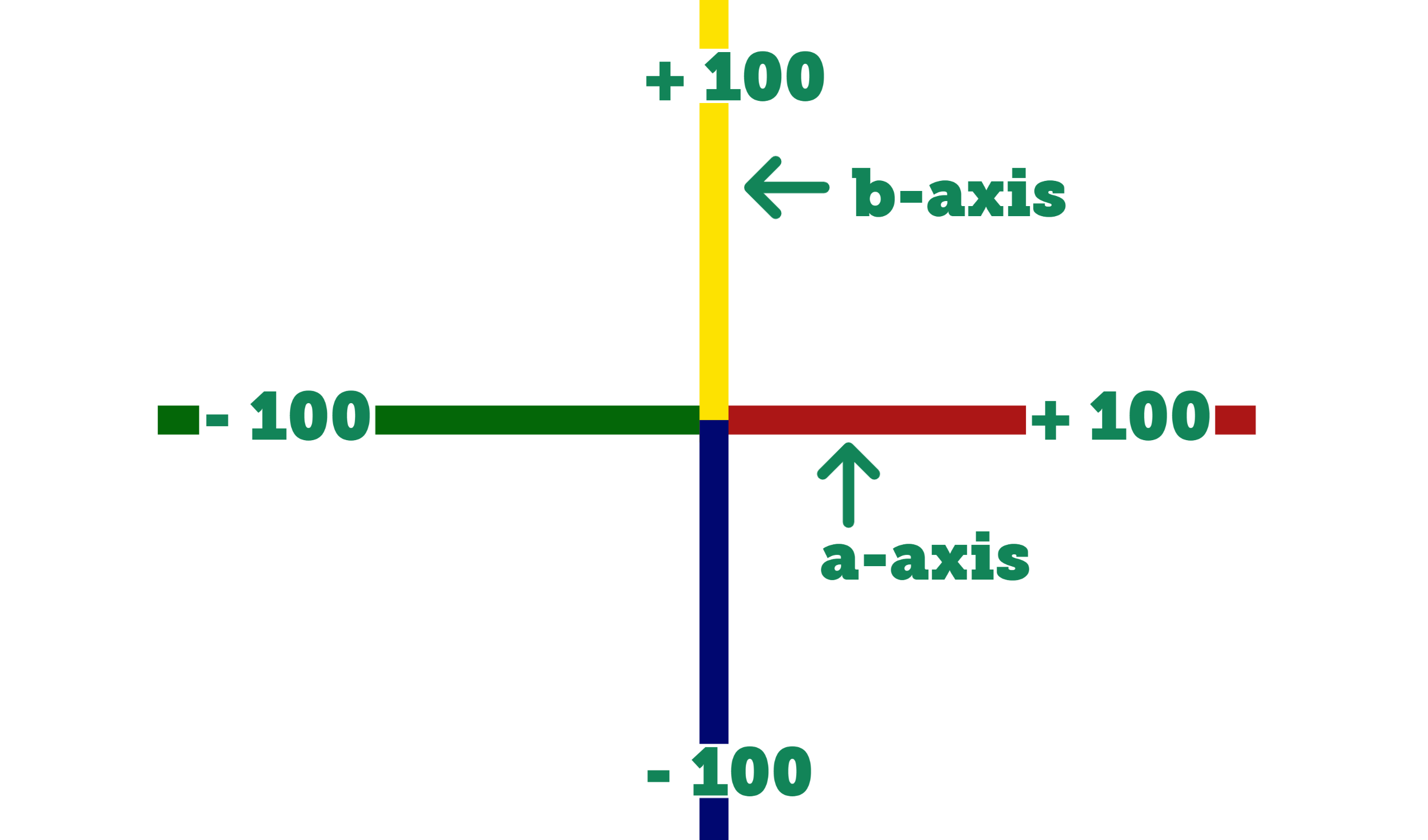
The CIELab color space represents the complete range of colors a human can see. Once major browsers support this notation it means way more colors for you!
For the second and third function parameter we move along the a and b axes of the color space. There are positive and negative values allowed. Positive values along the a-axis give you a red while negative values are green. On the b-axis, positive values are yellow and negative values are blue.

| 1 | 2 | 3 | 4 | 5 | 6 | 7 | 8 |
|---|---|---|---|---|---|---|---|
| lab | ( | 36% | 54 | -6 | ) |
The function starts with a lab.
The first value is the CIE lightness; usually, it is between 0% (black) and 100% (white). Still, it can exceed that range for extra bright whites up to 400%.

| 1 | 2 | 3 | 4 | 5 | 6 | 7 | 8 | 9 | 10 | 11 | 12 |
|---|---|---|---|---|---|---|---|---|---|---|---|
| lab | ( | 36% | 54 | -6 | / | 0.4 | ) |
A / as the separator between the color values and the alpha value.
You can define the alpha (opacity) value as a number between 0 and 1 or as a percentage. For example, 1 or 100% means full opacity, while 0.5 or
50% means half opacity.
No browser supports this way of expressing colors yet.
 1 :root{
 2     /* Use these as fallbacks now */
 3     --color:#9C2160;
 4     --color-alpha:#9C216066;
 5 }
 6
 7 .textsample{
 8     color:var(--color);
 9     color:lab(36% 54 -6);
10 }
11
12 .textsample_alpha{
13     color:var(--color-alpha);
14     color:lab(36% 54 -6 / 0.4);
15 }
Which notation is invalid?
The a in Lab stands for?
What range does the first parameter allow?
Another new way to express colors in the CSS 4 working draft is the lch() notation.

| 1 | 2 | 3 | 4 | 5 | 6 | 7 | 8 |
|---|---|---|---|---|---|---|---|
| lch | ( | 12% | 8 | 211 | ) |
The function starts with an lch.
The first value is the lightness; usually, it is between 0% (black) and 100% (white). Still, it can exceed that range for extra bright whites up to 400%.
The second value is the amount of color or chroma, usually between 0 and 230. A value above 77 exceeds the boundaries of the sRGB color space which most of the CSS color notations
use.

| 1 | 2 | 3 | 4 | 5 | 6 | 7 | 8 | 9 | 10 | 11 | 12 |
|---|---|---|---|---|---|---|---|---|---|---|---|
| lch | ( | 12% | 8 | 211 | / | 60% | ) |
A / as the separator between the color values and the alpha value.
You can define the alpha (opacity) value as a number between 0 and 1 or as a percentage. For example, 1 or 100% means full opacity, while 0.5 or
50% means half opacity.
No browser supports this way of expressing colors yet.
 1 :root{
 2     /* Use these as fallbacks now */
 3     --color:#0F2225;
 4     --color-alpha:#0F222599;
 5 }
 6
 7 .textsample{
 8     color:var(--color);
 9     color:lch(12% 8 211);
10 }
11
12 .textsample_alpha{
13     color:var(--color-alpha);
14     color:lch(12% 8 211 / 60%);
15 }
Which notation is invalid?
The h in Lab stands for?
What range of values can you use for the second parameter?
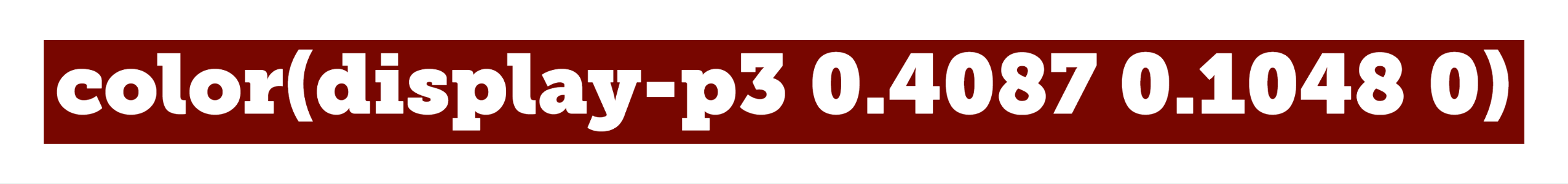
With the notation color(), CSS will allow you to specify colors in reference to a color profile. You can pass the color profile as the first parameter. You can pass one of the predefined color profiles
(srgb, prophoto-rgb, display-p3, rec-2020, a98-rgb) or you define an own profile.
If you want to add your own profile, you need to specify it first with a @color-profile rule. Then you can use it within the color() function, this works almost like defining new fonts via
@font-face.
| 1 | 2 | 3 | 4 | 5 | 6 | 7 | 8 | 9 | 10 |
|---|---|---|---|---|---|---|---|---|---|
| color | ( | display-p3 | 0.4087 | 0.1048 | 0 | ) |
The function starts with a color.
0 for the remaining. This repeats with
space as separator till the last value for the color space. In our example, we pass 3 values between 0 and 1, all separated by a space.

| 1 | 2 | 3 | 4 | 5 | 6 | 7 | 8 | 9 | 10 | 11 | 12 | 13 | 14 |
|---|---|---|---|---|---|---|---|---|---|---|---|---|---|
| color | ( | display-p3 | 0.4087 | 0.1048 | 0 | / | .8 | ) |
A / as the separator between the color values and the alpha value.
You can define the alpha (opacity) value as a number between 0 and 1 or as a percentage. For example, 1 or 100% means full opacity, while 0.5 or
50% means half opacity.
No browser supports this way of expressing colors yet.
 1 :root{
 2     /* Use these as fallbacks now */
 3     --color:#780600;
 4     --color-alpha:#780600CC;
 5 }
 6
 7 /* Defining a new Profile */
 8 @color-profile sample {
 9   src: url('https://howcolors.work/sample.icc');
10 }
11
12 /* Using the own Profile */
13 .textsample {
14     color:var(--color);
15     color:color(sample 0.4087 0.1048 0);
16 }
17
18 /* Using the predefined display-p3 Profile */
19 .textsample{
20     color:var(--color);
21     color:color(display-p3 0.4087 0.1048 0);
22 }
23
24 .textsample_alpha{
25     color:var(--color-alpha);
26     color:color(display-p3 0.4087 0.1048 0 / .8);
27 }
Which notation is invalid?
What does the first parameter define?
What range of values you can pass for the second and following parameters?
The gray() functional notation gives you completely desaturated colors. You only need to pass a single parameter, or two if you want to specify an alpha value. A value of 50, so
gray(50) would be right between black and white.

| 1 | 2 | 3 | 4 |
|---|---|---|---|
| gray | ( | 35 | ) |
The function starts with a gray.
50 would be right between black and white.
| 1 | 2 | 3 | 4 | 5 | 6 | 7 | 8 |
|---|---|---|---|---|---|---|---|
| gray | ( | 35 | / | 50% | ) |
A / as the separator between the color values and the alpha value.
You can define the alpha (opacity) value as a number between 0 and 1 or as a percentage. For example, 1 or 100% means full opacity, while 0.5 or
50% means half opacity.
No browser supports this way of expressing colors yet.
 1 :root{
 2     /* Use these as fallbacks now */
 3     --color:#525252;
 4     --color-alpha:#52525280;
 5 }
 6
 7 .textsample{
 8     color:var(--color);
 9     color:gray(35);
10 }
11
12 .textsample_alpha{
13     color:var(--color-alpha);
14     color:gray(35 / 50%);
15 }
Which notation is invalid?
What does the first parameter define?
What range of values can you pass for the second parameter?
In this chapter, I want to show you some cool ways to use colors in CSS. All following examples work with any of the above notations. Of course, you need to keep the notations browser support in mind, and if you use one of the new ways add a fallback color.
The CSS property to change the foreground or text color is color. In the examples above I showed you how to set a normal color as text color with the following code.
1 .textsample{
2 	color:var(--color);
3 	/* or */
4 	color:#FF0000;
5 }
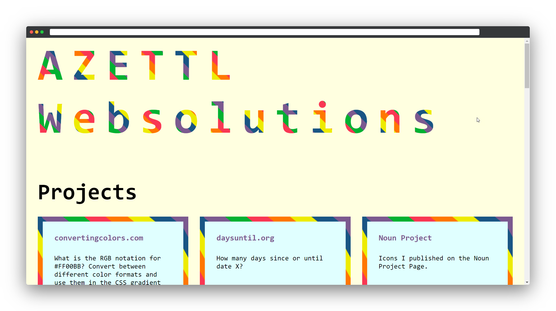
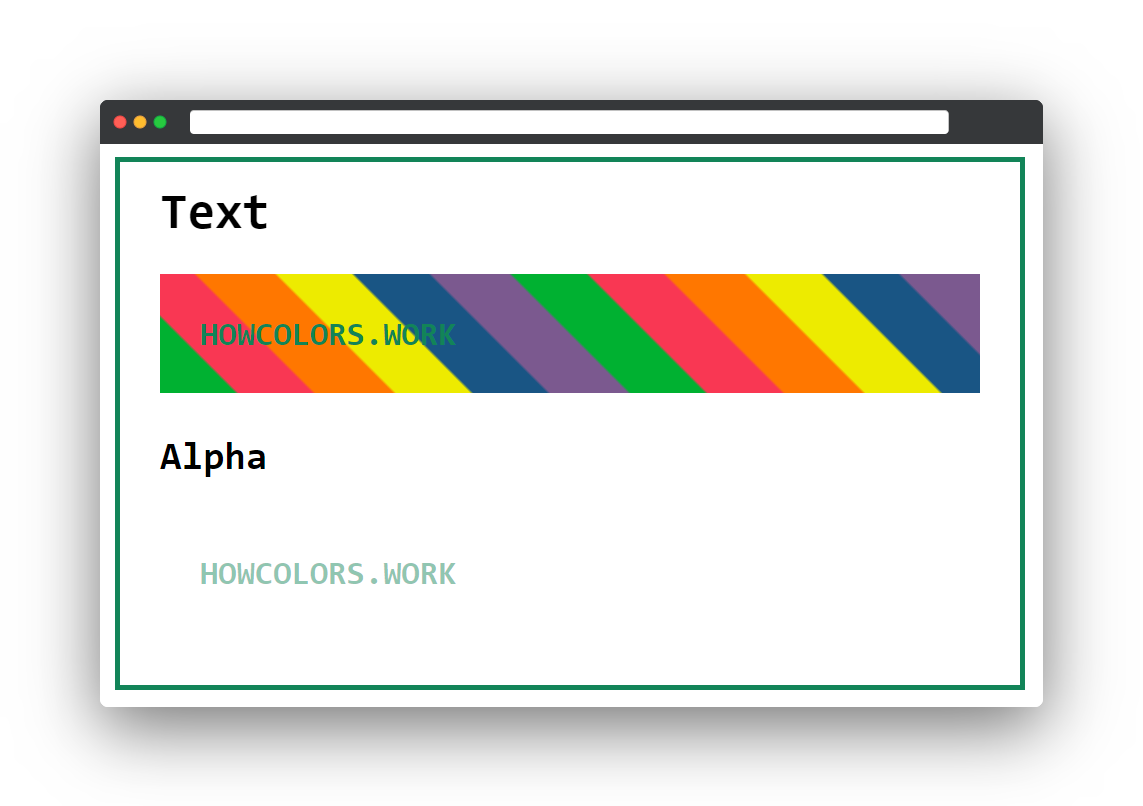
Now the cool part! Did you know you can use a CSS gradient as your text background? To get an idea of what is possible in modern browsers have a look at the screenshot of my personal website.
The trick here is to use the CSS properties background-clip and text-fill-color. You can use this if you do not need to
support Internet Explorer.
First, you will have to decide on a CSS gradient you want to use. If you are not sure how to create a gradient you can use any online generator to create one.
Look at the example code from the previous chapters. If you want to use a gradient as text background you will have to change the .textsample class.
Additionally to the color, you have to set a background-image. This is where you pass your gradient, in this example a linear-gradient.
1 .textsample{
2 	color:var(--color);
3 	background-image:linear-gradient(45deg,#00b131 8.33%,#f93753 8.33%,#f9\
4 3753 16.67%,#f70 16.67%,#f70 25%,#edeb00 25%,#edeb00 33.33%,#195584 33.\
5 33%,#195584 41.67%,#7b598f 41.67%,#7b598f 50%,#00b131 50%,#00b131 58.33\
6 %,#f93753 58.33%,#f93753 66.67%,#f70 66.67%,#f70 75%,#edeb00 75%,#edeb0\
7 0 83.33%,#195584 83.33%,#195584 91.67%,#7b598f 91.67%,#7b598f 100%);
8 }
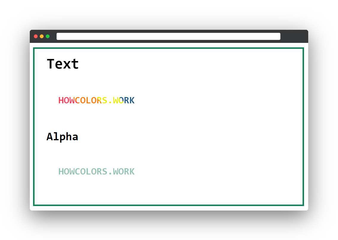
Until now you only set the gradient as a background of your element, but the text has still the same color as before. Now you need to add the background-clip and text-fill-color properties. The
text-fill-color you have to set to transparent and the background-clip you set to text. With this parameters, the background gradient gets clipped to the text and the text gets
a transparent filling.
 1 .textsample{
 2 	color:var(--color);
 3 	background-image:linear-gradient(45deg,#00b131 8.33%,#f93753 8.33%,#f9\
 4 3753 16.67%,#f70 16.67%,#f70 25%,#edeb00 25%,#edeb00 33.33%,#195584 33.\
 5 33%,#195584 41.67%,#7b598f 41.67%,#7b598f 50%,#00b131 50%,#00b131 58.33\
 6 %,#f93753 58.33%,#f93753 66.67%,#f70 66.67%,#f70 75%,#edeb00 75%,#edeb0\
 7 0 83.33%,#195584 83.33%,#195584 91.67%,#7b598f 91.67%,#7b598f 100%);
 8 	-webkit-background-clip:text;
 9 	-webkit-text-fill-color:transparent;
10 	-moz-background-clip:text;
11 	-moz-text-fill-color:transparent;
12 }
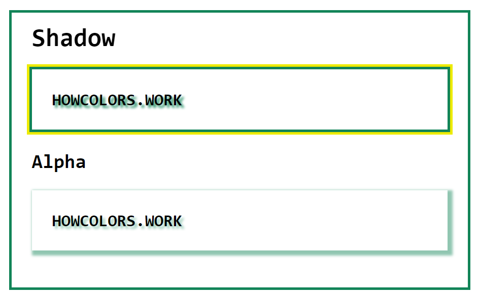
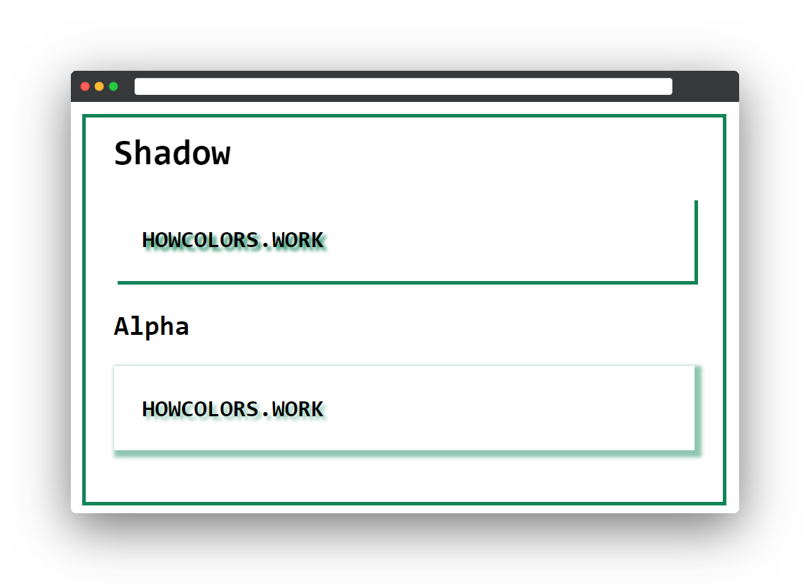
Wanting more than one border on an element is one unusual but cool use case for box shadows. In this example, we will use the .shadowsample class of the code from the above chapters.
1 .shadowsample{
2 	text-shadow:4px 4px 4px var(--color);
3 	/* offset-x | offset-y | blur-radius | spread-radius | color */
4 	box-shadow:4px 4px 4px 4px var(--color);
5 }
Let’s get rid of the blur and spread-radius first.
1 .shadowsample{
2 	text-shadow:4px 4px 4px var(--color);
3 	/* offset-x | offset-y | blur-radius | spread-radius | color */
4 	box-shadow:4px 4px 0 0 var(--color);
5 }
The box-shadow property allows you to pass multiple shadows by separating them with a comma. This you can use to create a basic border effect by adjusting the offset parameters.
1 .shadowsample{
2 	text-shadow:4px 4px 4px var(--color);
3 	/* offset-x | offset-y | blur-radius | spread-radius | color */
4 	box-shadow:4px 4px 0 0 var(--color), -4px 4px 0 0 var(--color), 4px -4\
5 px 0 0 var(--color), -4px -4px 0 0 var(--color);
6 }
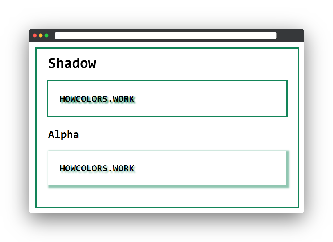
To add a second border around the first, all you need to do is add another set of box shadows. I use 8 pixels as an offset to get the same border width and the hex color #edeb00 as border color.
1 .shadowsample{
2 	text-shadow:4px 4px 4px var(--color);
3 	/* offset-x | offset-y | blur-radius | spread-radius | color */
4 	box-shadow:4px 4px 0 0 var(--color), -4px 4px 0 0 var(--color), 4px -4\
5 px 0 0 var(--color), -4px -4px 0 0 var(--color), 8px 8px 0 0 #edeb00, -\
6 8px 8px 0 0 #edeb00, 8px -8px 0 0 #edeb00, -8px -8px 0 0 #edeb00;
7 }