 htmlfigure { float: left }
Prince is a HTML-to-PDF-via-CSS converter. Prince 14 adds a nice bouquet of CSS properties to better support the placement of figures and ads. Before reading up on the technical solutions below, you may want to look at the gallery.
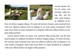
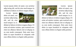
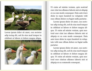
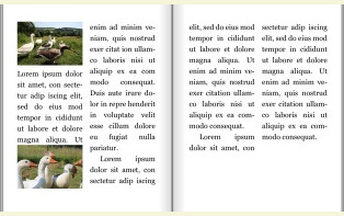
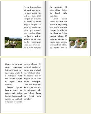
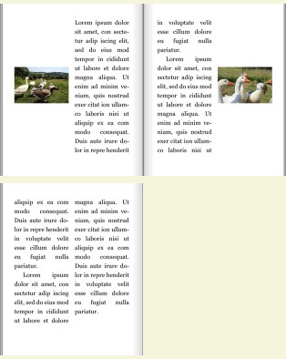
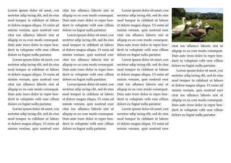
Then, consider what CSS can do without extensions – figures can be floated to the left:
htmlfigure { float: left }
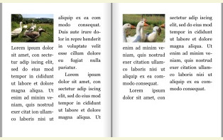
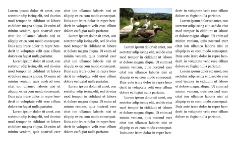
... or to the right:
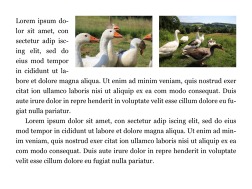 htmlfigure { float: right }
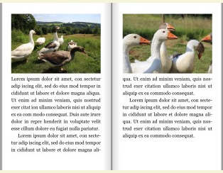
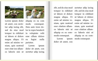
To avoid being next to each other, figures can ask for a clear position, where no other figures have been placed:
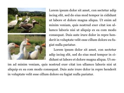 htmlfigure {
float: left;
clear: left;
}
htmlfigure {
  float: left;
  clear: left;
}
The above code works in common browsers today. The features described next are extenstions to float to better position figures on pages. Only Prince currently supports these extenstions. We will therefore add the -prince-
prefix to these properties.
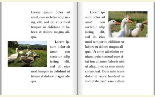
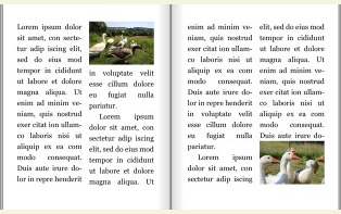
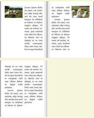
Printed books have left and right pages, with a binding in the middle. Figures are often floated to the outside margin, away from the binding:
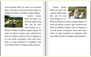 htmlfigure {
width: 50%;
-prince-float: outside;
-prince-margin-inside: 1em;
}
htmlfigure {
  width: 50%;
  -prince-float: outside;
  -prince-margin-inside: 1em;
}
Naturally, there are corresponding properties for inside:
 htmlfigure {
width: 50%;
-prince-float: inside;
-prince-margin-outside: 1em;
}
htmlfigure {
  width: 50%;
  -prince-float: inside;
  -prince-margin-outside: 1em;
}
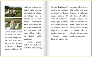
By setting a negative margin, figures can be moved into the margin area:
 htmlarticle {
-prince-margin-outside: 7em;
}
figure {
-prince-float: outside;
-prince-margin-outside: -7em;
-prince-margin-inside: 1em;
}
htmlarticle {
  -prince-margin-outside: 7em;
}
figure {
  -prince-float: outside;
  -prince-margin-outside: -7em;
  -prince-margin-inside: 1em;
}
Figures can be floated to the top or bottom of a page.
 htmlfigure {
-prince-float: top;
}
htmlfigure {
  -prince-float: top;
}
 htmlfigure {
-prince-float: bottom;
}
htmlfigure {
  -prince-float: bottom;
}
Prince can snap a figure to its nearest edge, be it top or bottom:
 htmlfigure {
-prince-float: snap;
margin: 0;
}
htmlfigure {
  -prince-float: snap;
  margin: 0;
}
When elements snap to the nearest edge, it is not possible to tell whether they will end up on top or bottom. If the element floats to the top, you typically want a zero top margin. Likewise, if an elements floats to the bottom, you want a zero bottom margin. To handle this, Prince introduces the prince-margin-alt property which provides alternative margin values. To set the alternative values to zero:
 htmlfigure {
-prince-float: snap;
margin: 1em 0;
-prince-margin-alt: 0;
}
htmlfigure {
  -prince-float: snap;
  margin: 1em 0;
  -prince-margin-alt: 0;
}
You can also set one or two lengths on prince-margin-alt to fine-tune placement of figures so that they align with other content. Most such fine-tuning will not be visible, but here's an example where visible space is added above figures that end up on top, and truncated below bottom-floating figures:
 htmlfigure {
-prince-float: snap;
margin: 1em 0;
-prince-margin-alt: 3em 0;
}
htmlfigure {
  -prince-float: snap;
  margin: 1em 0;
  -prince-margin-alt: 3em 0;
}
If you don't care too much about whether the figure ends up at the top or bottom, you can set:
 htmlfigure {
-prince-float: page;
}
htmlfigure {
  -prince-float: page;
}
Setting prince-float: page means that the figure will end up at the top of the page, unless another float is already there. In that case, the prince-clear property is consulted.
 htmlfigure {
-prince-float: page;
-prince-clear: end;
}
htmlfigure {
  -prince-float: page;
  -prince-clear: end;
}
Setting -prince-clear: end means that the figure demands a clear end, one that is not populated by another figure. Likewise, the figure can demand a clear page, where the figure demands a page not populated by another figure:
 htmlfigure {
-prince-float: page;
-prince-clear: page;
}
htmlfigure {
  -prince-float: page;
  -prince-clear: page;
}
Figures can float within their column:
 htmlfigure:nth-of-type(odd) { -prince-float: top }
figure:nth-of-type(even) { -prince-float: bottom }
htmlfigure:nth-of-type(odd) { -prince-float: top }
figure:nth-of-type(even) { -prince-float: bottom }
Figures can request to be floated with no strong preference for top or bottom placement:
 htmlfigure { -prince-float: column }
Setting -prince-float: column means that the figure will end up at the top of the column, unless another float is already there. In that case, the prince-clear property is consulted.
Just like page floats, column floats can be cleared so that they appear in oppsite ends of a column:
 htmlfigure {
-prince-float: column;
-prince-clear: end;
}
htmlfigure {
  -prince-float: column;
  -prince-clear: end;
}
That is, setting -prince-clear: end will make the figure appear alone in its column end, be it top or bottom.
A figure can also request to be alone in a column:
 htmlfigure {
-prince-float: column;
-prince-clear: column;
}
htmlfigure {
  -prince-float: column;
  -prince-clear: column;
}
Or, alone on a page:
 htmlfigure {
-prince-float: column;
-prince-clear: page;
}
htmlfigure {
  -prince-float: column;
  -prince-clear: page;
}
On a column float, a vertical margin set to auto
will expand and thereby repel other content:
 htmlfigure {
-prince-float: top;
-prince-clear: column;
margin-bottom: auto;
}
htmlfigure {
   -prince-float: top;
   -prince-clear: column;
   margin-bottom: auto;
}
This can also be used to push the float to the bottom and clear the column along the way:
 htmlfigure {
-prince-float: top;
-prince-clear: column;
margin-top: auto;
}
htmlfigure {
   -prince-float: top;
   -prince-clear: column;
   margin-top: auto;
}
When both top and bottom margins are auto, the figure will end up being vertically centered:
 htmlfigure {
-prince-float: top;
-prince-clear: column;
margin: auto 0;
}
htmlfigure {
   -prince-float: top;
   -prince-clear: column;
   margin: auto 0;
}
As seen above, figures can easily be floated within columns. It is also possible for figures to escape their multi-column context:
 htmlarticle {
columns: 2;
}
figure {
-prince-float: page bottom;
margin-top: 1em;
}
htmlarticle {
  columns: 2;
}
figure {
  -prince-float: page bottom;
  margin-top: 1em;
}
The page keyword changes the reference from column to page. Having multiple keywords on the float property is a Prince extension which turns the property into a CSS shorthand. The longhand is:
  -prince-float-reference: page;
  -prince-float-placement: bottom;
Making page the float reference looks a bit like setting column-span: all. But there are important differences which become apparent when the parent element is given a padding:
 htmlarticle {
columns: 2;
padding: 1cm;
background: gainsboro;
}
figure {
-prince-float: bottom;
column-span: all;
}
htmlarticle {
  columns: 2;
  padding: 1cm;
  background: gainsboro;
}
figure {
  -prince-float: bottom;
  column-span: all;
}
As you can see above, a figure with column-span: all will stay within its parent element. In comparison, a figure with -prince-float-reference: page will escape its parent and align itself with the page area:
 htmlarticle {
columns: 2;
padding: 1cm;
background: gainsboro;
}
figure {
-prince-float-placement: bottom;
-prince-float-reference: page;
}
htmlarticle {
  columns: 2;
  padding: 1cm;
  background: gainsboro;
}

figure {
  -prince-float-placement: bottom;
  -prince-float-reference: page;
}
Figures can be deferred so that they are laid out at a later stage. For example, an advertiser may prefer to place a glamorous full-page ad on a right page:
 html@page {
size: 160mm 200mm;
margin: 10mm;
}
@page ad {
size: 160mm 200mm;
margin: 0mm;
@bottom { content: "" }
}
figure {
page: ad;
-prince-float: top;
-prince-float-defer-page: right;
width: 100%;
}
<figure><img src=gjess6p.jpg></figure>
<article>
...
html@page {
  size: 160mm 200mm;
  margin: 10mm;
}

@page ad {
  size: 160mm 200mm;
  margin: 0mm;
  @bottom { content: "" }
}

figure {
  page: ad;
  -prince-float: top;
  -prince-float-defer-page: right;
  width: 100%;
}

<figure><img src=gjess6p.jpg></figure>
<article>
...
Notice that the figure above uses a named page (called ad
) to avoid margins and page numbers.
Figures can also be deferred to a certain column. In this example, the byline will appear in the second column:
 htmlh1 {
-prince-float: top;
-prince-float-reference: page;
}
.byline {
-prince-float: bottom;
-prince-float-defer-column: 1;
font-style: italic;
padding: 0.5em;
margin-top: 0.7em;
border-top: thin solid black;
background: gray;
color: white;
}
htmlh1 {
  -prince-float: top;
  -prince-float-reference: page;
}
.byline {
  -prince-float: bottom;
  -prince-float-defer-column: 1;
  font-style: italic;
  padding: 0.5em;
  margin-top: 0.7em;
  border-top: thin solid black;
  background: gray;
  color: white;
}
The above example shows any element, not just figures, can be floated, cleared, and deferred.
 htmlarticle {
columns: 3;
}
figure {
column-span: 2;
-prince-float-placement: top;
-prince-float-reference: column;
-prince-float-defer-column: outside;
}
htmlarticle {
  columns: 3;
}
figure {
  column-span: 2;
  -prince-float-placement: top;
  -prince-float-reference: column;
  -prince-float-defer-column: outside;
}
Placement in the last column is commonly seen. And easily achieved:
 htmlarticle {
columns: 4;
}
figure {
-prince-float: column;
-prince-float-defer-column: last;
}
htmlarticle {
  columns: 4;
}

figure {
  -prince-float: column;
  -prince-float-defer-column: last;
}
When using negative numbers, columns are counted from the end:
 htmlarticle {
columns: 4;
}
figure {
-prince-float: column;
-prince-float-defer-column: -2;
}
htmlarticle {
  columns: 4;
}

figure {
  -prince-float: column;
  -prince-float-defer-column: -2;
}
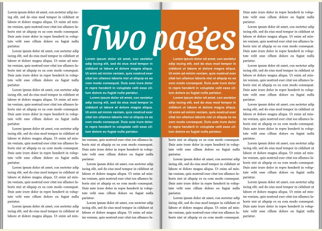
CSS doesn't have a notion of page spreads
, but the float-defer
properties make it possible – even easy – to place an image over a spread. That is, one part of the image is shown on the left page, and the other part is on the right.
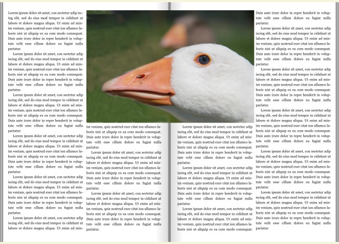 htmlfigure {
width: 110vw;
-prince-float: top;
-prince-float-defer-page: left;
-prince-float-defer-column: inside;
}
figure:nth-of-type(2) {
-prince-float-defer-page: right;
margin-inside: -55vw;
}
...
<figure><img src=gjess8single.jpg></figure>
<figure><img src=gjess8single.jpg></figure>
htmlfigure {
  width: 110vw;
  -prince-float: top;
  -prince-float-defer-page: left;
  -prince-float-defer-column: inside;
}

figure:nth-of-type(2) {
  -prince-float-defer-page: right;
  margin-inside: -55vw;
}
...
<figure><img src=gjess8single.jpg></figure>
<figure><img src=gjess8single.jpg></figure>
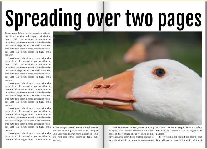
The trick here is to have two figure elements with the same image. By carefully placing these images in the inside columns of a left and right page, and by adding a negative margin on the right image, the two image halves will reconstitute the image.
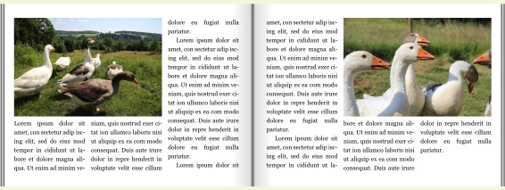
Elements placed on a spread can be asymmetric. In this example, the right image spans two columns. The binding of a book will often hide part of the image, so it makes sense to duplicate a strip of the image in the fold. Therefore, the beak has a notch in this example:
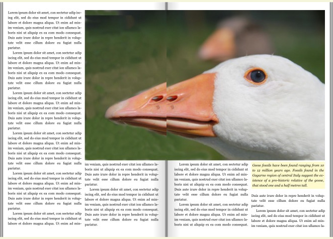 htmlfigure {
width: 150vw;
-prince-float: top;
-prince-float-defer-page: left;
-prince-float-defer-column: inside;
}
figure:nth-of-type(2) {
column-span: 2;
-prince-float-defer-page: right;
margin-inside: -50vw;
}
figcaption {
background: lemonchiffon;
font-style: italic;
padding: 0.3em;
-prince-float: top;
-prince-float-defer-page: right;
-prince-float-defer-column: last;
}
...
<figure><img src=gjess8single.jpg></figure>
<figure><img src=gjess8single.jpg><figcaption>...</figcaption></figure>
htmlfigure {
  width: 150vw;
  -prince-float: top;
  -prince-float-defer-page: left;
  -prince-float-defer-column: inside;
}

figure:nth-of-type(2) {
  column-span: 2;
  -prince-float-defer-page: right;
  margin-inside: -50vw;
}

figcaption {
  background: lemonchiffon;
  font-style: italic;
  padding: 0.3em;
  -prince-float: top;
  -prince-float-defer-page: right;
  -prince-float-defer-column: last;
}
...
<figure><img src=gjess8single.jpg></figure>
<figure><img src=gjess8single.jpg><figcaption>...</figcaption></figure>
This example also has a figcaption element which only needs to be present in one of the figure elements.
The trick used for images above also works for textual content. You will need two identical elements, carefully placed in the inside columns. To show that we are dealing with two different – although identical – elements, they are given different background colors in this example:
 htmlaside {
width: 110vw;
box-sizing: border-box;
columns: 2;
column-gap: 4em;
padding: 1em;
-prince-float: top;
-prince-float-defer-page: left;
-prince-float-defer-column: inside;
background: darkcyan;
color: white;
}
aside:nth-of-type(2) {
-prince-float-defer-page: right;
margin-inside: -60vw;
background: chocolate;
}
...
<aside>...</aside>
<aside>...</aside>
htmlaside {
  width: 110vw;
  box-sizing: border-box;
  columns: 2;
  column-gap: 4em;
  padding: 1em;
  -prince-float: top;
  -prince-float-defer-page: left;
  -prince-float-defer-column: inside;
  background: darkcyan;
  color: white;
}

aside:nth-of-type(2) {
  -prince-float-defer-page: right;
  margin-inside: -60vw;
  background: chocolate;
}
...
<aside>...</aside>
<aside>...</aside>
 htmlh1 {
font: 1em/1 Fjalla One;
width: 210vw;
box-sizing: border-box;
-prince-float: top page;
-prince-float-defer-page: left;
}
h1:nth-of-type(2) {
-prince-float-defer-page: right;
margin-inside: -110vw;
}
...
<h1>Spreading over two pages</h1>
<h1>Spreading over two pages</h1>
htmlh1 {
  font: 1em/1 Fjalla One;
  width: 210vw;
  box-sizing: border-box;
  -prince-float: top page;
  -prince-float-defer-page: left;
}

h1:nth-of-type(2) {
  -prince-float-defer-page: right;
  margin-inside: -110vw;
}
...
<h1>Spreading over two pages</h1>
<h1>Spreading over two pages</h1>
When we know that a figure will appear in the outside column, we can make it overflow into the outside margin:
 htmlarticle {
-prince-margin-outside: 10em;
columns: 2;
}
figure {
-prince-float: top;
-prince-clear: end;
-prince-float-defer-column: outside;
-prince-margin-outside: -10em;
width: calc(100% + 10em);
}
htmlarticle {
  -prince-margin-outside: 10em;
  columns: 2;
}

figure {
  -prince-float: top;
  -prince-clear: end;
  -prince-float-defer-column: outside;
  -prince-margin-outside: -10em;
  width: calc(100% + 10em);
}
Figures often come with captions that are placed in the margin area. When we are able to defer figures so that they appear in the outside colums, we can position captions so that they appear outside the figure. This way, we can achieve a commonly seen layout:
 htmlarticle {
-prince-margin-outside: 10em;
columns: 2;
}
figure {
width: calc(100% + 10em);
-prince-float: top;
-prince-clear: end;
-prince-float-defer-page: left;
-prince-float-defer-column: outside;
-prince-margin-alt: 0.5em;
-prince-margin-outside: -10em;
margin-bottom: 0.7em;
}
figure img {
width: calc(100% - 10em);
-prince-float: inside;
-prince-margin-outside: 1em;
}
figure:nth-of-type(even) {
-prince-float-defer-page: right;
}
figure figcaption {
font-style: italic;
padding: 0 1em 1em 0;
background: beige;
text-align: right;
}
figure:nth-of-type(even) figcaption {
text-align: left;
}
htmlarticle {
  -prince-margin-outside: 10em;
  columns: 2;
}

figure {
  width: calc(100% + 10em);
  -prince-float: top;
  -prince-clear: end;
  -prince-float-defer-page: left;
  -prince-float-defer-column: outside;
  -prince-margin-alt: 0.5em;
  -prince-margin-outside: -10em;
  margin-bottom: 0.7em;
}

figure img {
  width: calc(100% - 10em);
  -prince-float: inside;
  -prince-margin-outside: 1em;
}

figure:nth-of-type(even) {
  -prince-float-defer-page: right;
}

figure figcaption {
  font-style: italic;
  padding: 0 1em 1em 0;
  background: beige;
  text-align: right;
}

figure:nth-of-type(even) figcaption {
  text-align: left;
}
Figures that extend into the margin area often have captions below the image:
 html@page {
size: 160mm 120mm;
}
article {
-prince-margin-outside: 10em;
columns: 2;
}
figure {
position: relative;
-prince-float: top;
-prince-clear: end;
-prince-float-defer-page: left;
-prince-float-defer-column: outside;
-prince-margin-outside: -10em;
width: calc(100% + 10em);
}
figure:nth-of-type(even) {
-prince-float-defer-page: right;
}
figure figcaption {
font-style: italic;
position: absolute;
top: 100%;
padding: 4px 2px 2px 2px;
left: 0;
width: 9em;
background: beige;
text-align: left;
}
figure:nth-of-type(even) figcaption {
left: auto;
right: 0;
text-align: right;
}
html@page {
  size: 160mm 120mm;
}

article {
  -prince-margin-outside: 10em;
  columns: 2;
}

figure {
  position: relative;
  -prince-float: top;
  -prince-clear: end;
  -prince-float-defer-page: left;
  -prince-float-defer-column: outside;
  -prince-margin-outside: -10em;
  width: calc(100% + 10em);
}

figure:nth-of-type(even) {
  -prince-float-defer-page: right;
}

figure figcaption {
  font-style: italic;
  position: absolute;
  top: 100%;
  padding: 4px 2px 2px 2px;
  left: 0;
  width: 9em;
  background: beige;
  text-align: left;
}

figure:nth-of-type(even) figcaption {
  left: auto;
  right: 0;
  text-align: right;
}
Floating figures can sometimes make figures appear in a different order than the source order. For example, consider this code:
figure { -prince-float: bottom }

<figure class=one></figure>
<figure class=two></figure>
Which order should these figures appear in? One above two, or two above one? The answer is provided by the -prince-float-policy. If you want one above two (which is the source order), use this code:
figure {
  -prince-float: bottom;
  -prince-float-policy: in-order;
}
If you want two above one (which is the processing order), the initial normal value will suffice:
figure {
  -prince-float: bottom;
  -prince-float-policy: normal;
}
In another example, figures should not be shown on the first page of an article. The first figure is therefore deferred by one page:
 htmlfigure:first-of-type {
-prince-float-defer-page: 1;
}
figure {
-prince-float: column-top;
-prince-clear: end;
}
htmlfigure:first-of-type {
  -prince-float-defer-page: 1;
}
figure {
  -prince-float: column-top;
  -prince-clear: end;
}
However, while the first figure (in source order) appears on the second page, the second figure appears on the first page. To avoid figures appearing out of order, the prince-float-policy property can be used:
 htmlfigure:first-of-type {
-prince-float-defer-page: 1;
}
figure {
-prince-float: top;
-prince-float-policy: in-order;
-prince-clear: end;
}
htmlfigure:first-of-type {
  -prince-float-defer-page: 1;
}
figure {
  -prince-float: top;
  -prince-float-policy: in-order;
  -prince-clear: end;
}
To align with the paper edge, you need to keep track of page and element margins:
 html@page {
size: 180mm 120mm;
margin: 10mm;
}
article {
-prince-margin-outside: 50mm;
columns: 2;
}
figure, figcaption { margin: 0; padding: 0 }
figure {
position: relative;
-prince-float: top;
-prince-clear: end;
-prince-float-defer-page: left;
-prince-float-defer-column: outside;
-prince-margin-alt: -10mm 0;
-prince-margin-outside: -60mm;
width: calc(100% + 60mm);
height: auto;
line-height: 0;
}
figure:nth-of-type(even) {
-prince-float-defer-page: right;
}
figure figcaption {
font-style: italic;
position: absolute;
top: 100%;
left: 5mm;
width: 50mm;
text-align: right;
z-index: -1;
background: beige;
}
figcaption p {
font: italic 1em/1.3 sans-serif, serif;
padding: 0.3em;
}
figure:nth-of-type(even) figcaption {
left: auto;
right: 5mm;
text-align: left;
}
html@page {
  size: 180mm 120mm;
  margin: 10mm;
}

article {
  -prince-margin-outside: 50mm;
  columns: 2;
}

figure, figcaption { margin: 0; padding: 0 }

figure {
  position: relative;
  -prince-float: top;
  -prince-clear: end;
  -prince-float-defer-page: left;
  -prince-float-defer-column: outside;
  -prince-margin-alt: -10mm 0;
  -prince-margin-outside: -60mm;
  width: calc(100% + 60mm);
  height: auto;
  line-height: 0;
}

figure:nth-of-type(even) {
  -prince-float-defer-page: right;
}

figure figcaption {
  font-style: italic;
  position: absolute;
  top: 100%;
  left: 5mm;
  width: 50mm;
  text-align: right;
  z-index: -1;
  background: beige;
}

figcaption p {
  font: italic 1em/1.3 sans-serif, serif;
  padding: 0.3em;
}

figure:nth-of-type(even) figcaption {
  left: auto;
  right: 5mm;
  text-align: left;
}
The discerning reader will notice that the baselines are not alinged in the above example. Another guide will tell you how to rectify the situation.
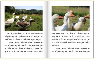
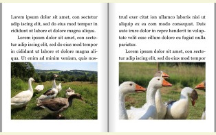
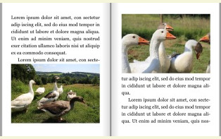
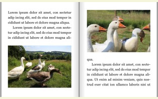
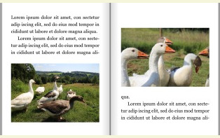
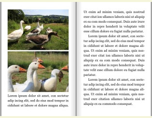
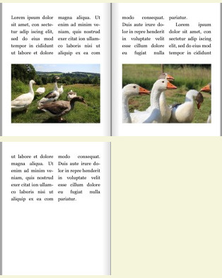
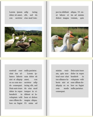
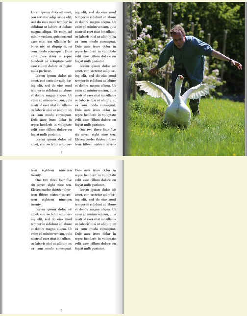
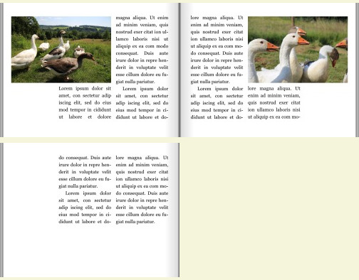
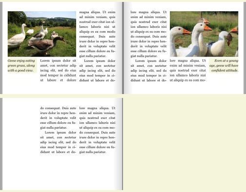
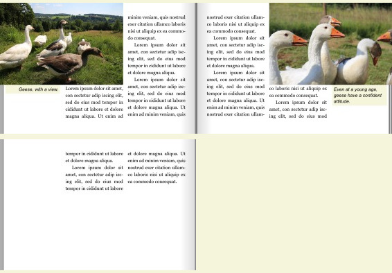
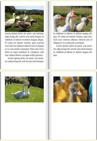
In magazine layout, you typically want to intersperse text and images. For example, you may want one or two images on every page. So, to illustrate a text, a bunch of images should be supplied. Here is an example with four images:
 htmlimg {
-prince-float: page;
-prince-clear: page;
-prince-float-tail: keep;
}
<img src=gjess1.jpg>
<img src=gjess2.jpg>
<img src=gjess3.jpg>
<img src=gjess4.jpg>
htmlimg {
  -prince-float: page;
  -prince-clear: page;
  -prince-float-tail: keep;
}

<img src=gjess1.jpg>
<img src=gjess2.jpg>
<img src=gjess3.jpg>
<img src=gjess4.jpg>
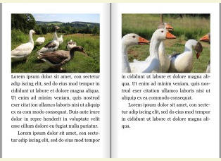
In the above example, the text only fills two pages or so, so you end up with a long tail of pages with only images. To drop the long tail, you can use the -prince-float-tail: fill-page:
 htmlimg {
-prince-float: page;
-prince-clear: page;
-prince-float-tail: fill-page;
}
<img src=gjess1.jpg>
<img src=gjess2.jpg>
<img src=gjess3.jpg>
<img src=gjess4.jpg>
<img src=gjess-narrow.jpg>
htmlimg {
  -prince-float: page;
  -prince-clear: page;
  -prince-float-tail: fill-page;
}

<img src=gjess1.jpg>
<img src=gjess2.jpg>
<img src=gjess3.jpg>
<img src=gjess4.jpg>
<img src=gjess-narrow.jpg>
This feature is not yet fully developed; we plan to add more keywords.
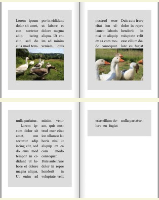
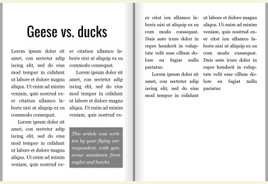
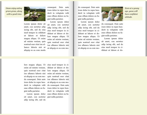
These extensions described in this guide have been developed and discussed in the context of W3C and WhatWG ([1][2][3]). The geese pictures were first used in the WhatWG draft, first published in October 2013. The *-defer-*
properties were worked out on a whiteboard with Morten Stenshorne on Rune Lillesveen on Feb 18, 2013. Almost a decade later, we have an implementation which is able to generate the motivational example from the simple HTML markup:
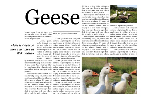 html<h1>Geese</h1>
<div class=byline>From our garden correspondent</div>
<figure><img src=gjess1.jpg></figure>
<figure><img src=gjess2.jpg></figure>
...
html<h1>Geese</h1>
<div class=byline>From our garden correspondent</div>
<figure><img src=gjess1.jpg></figure>
<figure><img src=gjess2.jpg></figure>
...
By setting the page size to be portrait, rather than landscape, the same code renders:
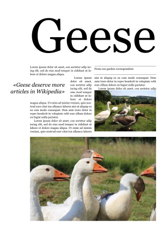 html<h1>Geese</h1>
<div class=byline>From our garden correspondent</div>
<figure><img src=gjess1.jpg></figure>
<figure><img src=gjess2.jpg></figure>
...
html<h1>Geese</h1>
<div class=byline>From our garden correspondent</div>
<figure><img src=gjess1.jpg></figure>
<figure><img src=gjess2.jpg></figure>
...