You could probably achieve this through the box-tracking API. But I hope this is something Prince can support natively in the future, it's a good proposal.
The reason it hasn't been implemented is because I'm not aware of anything that specifically calls for balanced text. The spec text suggests headings and captions (and pull quotes have also been mentioned), but these use cases merely call for putting more emphasis on avoiding very short last lines rather than specifically minimizing standard deviation over all lines.
Consider the case of a paragraph whose text is just slightly longer than can fit in one line. In this case, it actually looks fairly odd to have two lines that each fill only the left 57% of the available space (with the second line being longer than the first, half of the time).
If you were manually setting type for a caption then you might make the two lines be roughly equal length, but you'd probably make the second line shorter than the first, and you'd probably either increase margin-left to make the paragraph closer to centered under the image or table that it captions, or you'd make the paragraph be a more pleasing proportion of the width of the image or table.
(If you were forced to use text-wrap:balance then you might choose text-align:center to reduce this problem, but if you were setting text manually then you would usually prefer for the lines' start edges to be aligned.)
You would also give some attention to breaking according to phrasing (especially in headings) rather than simply minimizing variation.
For paragraphs of three or more lines, you would give some attention to the shape formed by the right edges, avoiding the distracting coincidences and straight lines that actually become more likely to occur if mechanically trying to minimize standard deviation.
I've raised these issue with the spec editors, though they haven't acted, other than more clearly specifying the undesirable behaviour for forced breaks within the paragraph.
Prince for Books does have ‘-prince-line-breaking-choices: heading’ and ‘-prince-line-breaking-choices: title-page’. Unlike text-wrap:balance, they give at least a little attention to the other issues I've mentioned above. Both avoid the last line being very short; though this line will still typically be shorter than the other lines.
(If for some reason you want to avoid the last line appearing shorter than the others, then you can use ‘-prince-forced-breaks: full’. Incidentally, this is an inline-level property, so you can also apply it on specific <br> elements for a line-by-line choice of which forced breaks are allowed to look visibly shorter than the others.)
The specification of text-wrap:balance doesn't mention how hyphenation behaves, but ‘heading’ and ‘title-page’ each tend to avoid hyphenating words (while still allowing in very rare cases).
‘title-page’ differs from ‘heading’ in treatment of span elements (e.g. italicized or marked up as being in a different language): ‘title-page’ allows lines to vary considerably in length if this helps phrasing, and similarly is more accepting of this changing how many lines the paragraph occupies.
So, what did you want to use it for, and what should the behaviour be in the case of a line whose width is slightly more than one full line? How much should hyphenation or other poor phrasing be allowed? What should the behaviour be if there's more than one paragraph, or if the paragraph contains a forced break?
In this last example, the large "My" is an effect. However, in most headings, you want the difference to be minimal and balancing the text before applying the font-size adjustment therefore makes sense.
Do either of you have examples where hyphenation has been used? My feeling is that this style of justification usually avoids hyphenation even if huge words result (and this can easily be achieved by setting hyphens:manual); but I suppose there must also be cases where it was considered worthwhile to hyphenate, and it would be good if authors could leave ‘hyphens’ set to ‘auto’ and get an overall improvement.
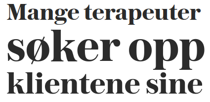
Granted, this effect will always benefit a lot from manual decisions, because the scaling results in emphasis, whose effect is best judged by a human. Breaking as "Mange terapeut- / er søker opp / klientene sine" would result in less size variation, but whether it's actually better depends in part on whether it's good or bad for “søker opp" to be emphasized.
The only case of hyphens in titles I'd be aware of is when the hyphen would be connecting the words even if no newline would happen - most of the time I see it in German online newspapers, such as:
Europawahl 2024: Strack-Zimmermann soll FDP- Spitzenkandidatin für Europawahl werden
I have a use case for "text-wrap: balance" as well – my company uses Prince to lay out board and card games, and there's a specific need to avoid unbalanced lines of text when laying out player-facing instructions on rules cards. As a game may contain a very large number of such cards, with their text being prone to frequent modification due to errata, this is time-consuming to achieve by hand, and manual solutions are prone to frequent disruption; having access to something like "text-wrap: balance" would make such products much more maintainable.
Just noting another use case: cover pages where the title is variable and can flow onto multiple lines. Prince's default line breaking can leave short words awkwardly placed on their own lines. text-wrap: balance works beautifully in Chrome for this.
Without text-wrap: balance I'm manually calculating where to introducing non-breaking spaces.
And this is different from other text placement controls like orphans/widows (there is no page break) and hyphenation looks bad in titles.
The projects I help to publish use a canonical source of content managed by a CMS for both responsive web formats and printed formats rendered to PDF with Prince. So, manually controlling line breaks with markup is a big no-no, because that can break responsive behavior in the browser.
While the CSS may differ from format to format, the content stored in the content database cannot.
Has anyone had any luck achieving this sort of thing via the box-tracking API, as suggested upthread? I have a project coming down the pipeline in the next few months that would benefit from having a line-balancing mechanism for certain types of headers, and given that this isn't yet on the roadmap for Prince, I'm curious how one might go about it using Javascript instead.
This is a very useful property. A lot of people above have missed the fact that balance also applies to inline images which can be super useful in preventing orphan full stops wrapping after an inline image for example.
I'm sorry, I might have been unclear. I was looking for the general documentation on the "text-wrap" property, not the specific value of "balance". (I admit that posting this here might have caused confusion!)